
John-Paul Henry

Creative & Design Leadership ·
Brand, Customer & Product Experience

Translating brands into experiences felt across digital and physical.

A design leader with 13+ years leading large-scale design and customer experience transformation across aviation, sport and retail — building international teams, embedding design systems at scale and connecting experience strategy to commercial performance.

Currently
Design Principal, Air France-KLM
Selected brands

About

Portrait of John-Paul Henry

A trusted partner to senior leaders across Digital, Commercial, Brand and Operations — known for turning fragmented experiences into cohesive, experience-led businesses.

I shape distinctive customer and brand experiences across digital, service and physical touchpoints, connecting brand strategy, customer needs, product thinking and commercial priorities.

I've built and scaled international design organisations of 60+, created design languages and systems used across entire airlines, and led brand-defining digital work for some of the world's best-known brands. I'm grounded in human-centred design and craft, with a growing focus on how AI will reshape creative practice and customer experience.

Experience

  • 2022 — NowAir France-KLMDesign Principal, Experience Design
  • 2021 — 2022adidas GroupSenior Global Design Lead
  • 2019 — 2021British AirwaysHead of Apps & .com
  • 2016 — 2019British AirwaysSenior Design Manager
  • 2013 — 2016Warehouse & Oasis FashionCreative Design Manager

Areas of expertise

  • Creative and design leadership
  • Brand experience and identity systems
  • Customer experience strategy
  • Design languages, systems and governance
  • Organisational transformation
  • Generative, conversational and agentic AI

KLM Royal Dutch Airlines

The right amount of brand, at the right moment

Brand Engagement Levels

Client
KLM
Scope
Brand application framework across physical and digital touchpoints
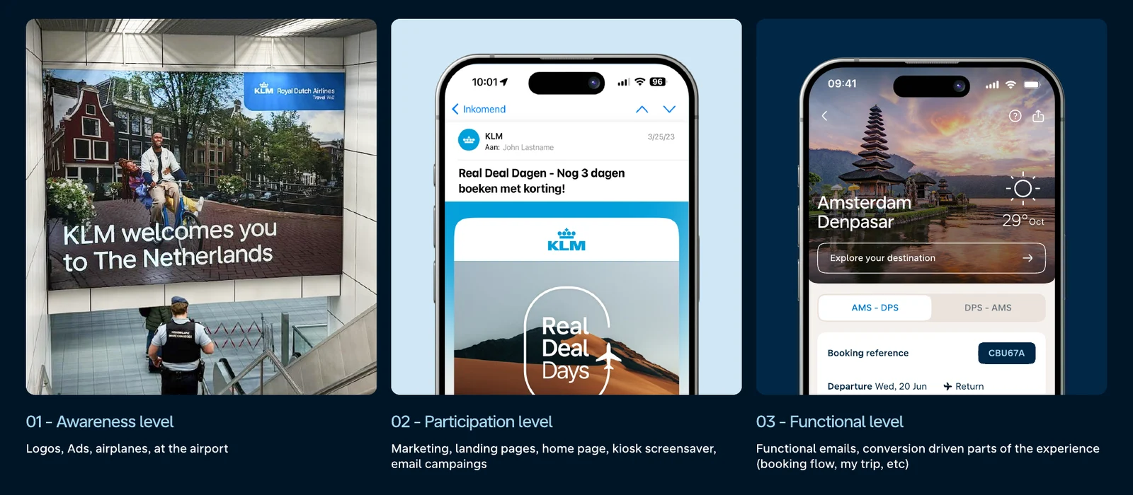
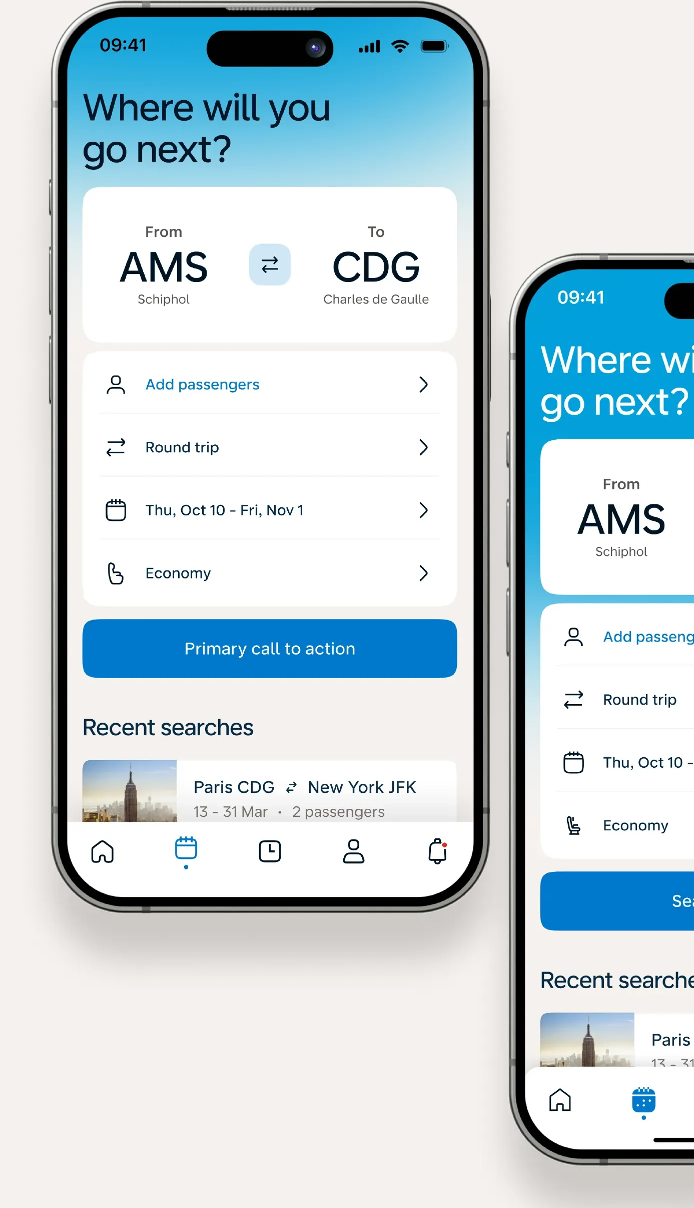
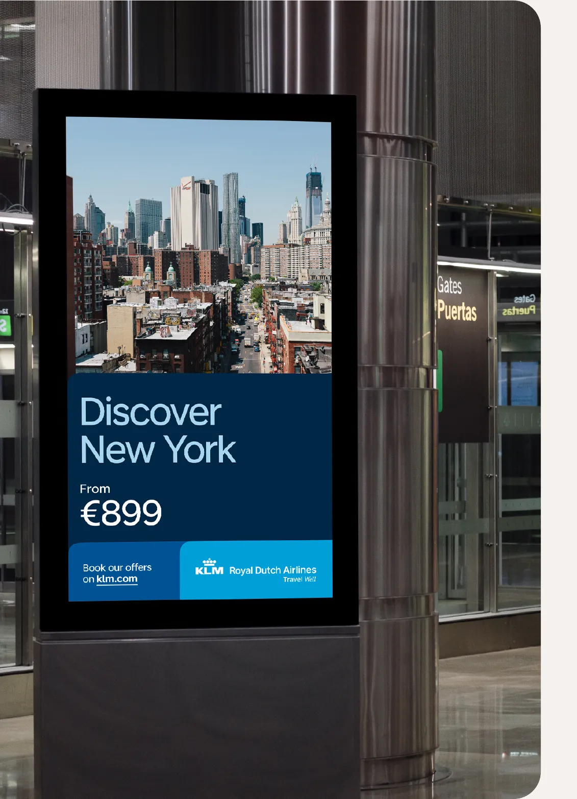
Brand engagement in context: an airport poster, a marketing email and the KLM app

We don’t apply every brand element everywhere. Instead, we design with brand engagement levels, based on the customer’s context.

The challenge

KLM needs to be unmistakable on a billboard at Schiphol, yet quiet enough to stay out of the way when someone is paying for an upgrade. Brand engagement levels give designers, marketers and developers one shared rule for how much brand to bring to each moment of the customer journey, from the airport to the inbox to the app.

Three levels, one journey

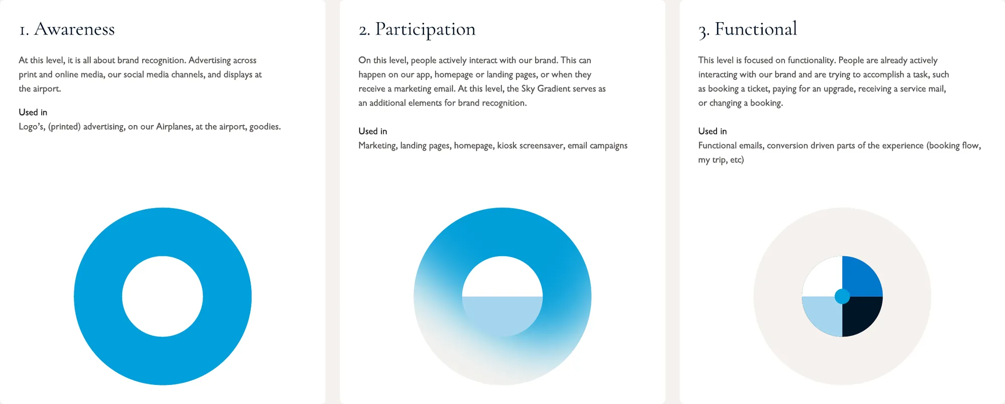
Brand engagement is defined in three levels, based on the customer journey. On the first level, brand elements are used big and bold: the blue panel and large branded photography. By the third level, the brand is carried by its smaller elements: typography and iconography.
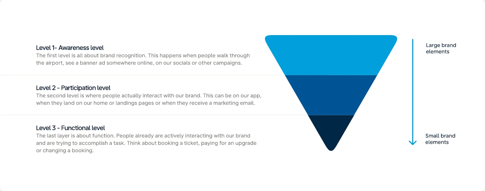
Diagram of the three brand engagement levels, from large brand elements at awareness to small brand elements at the functional level

Level 1 — Awareness

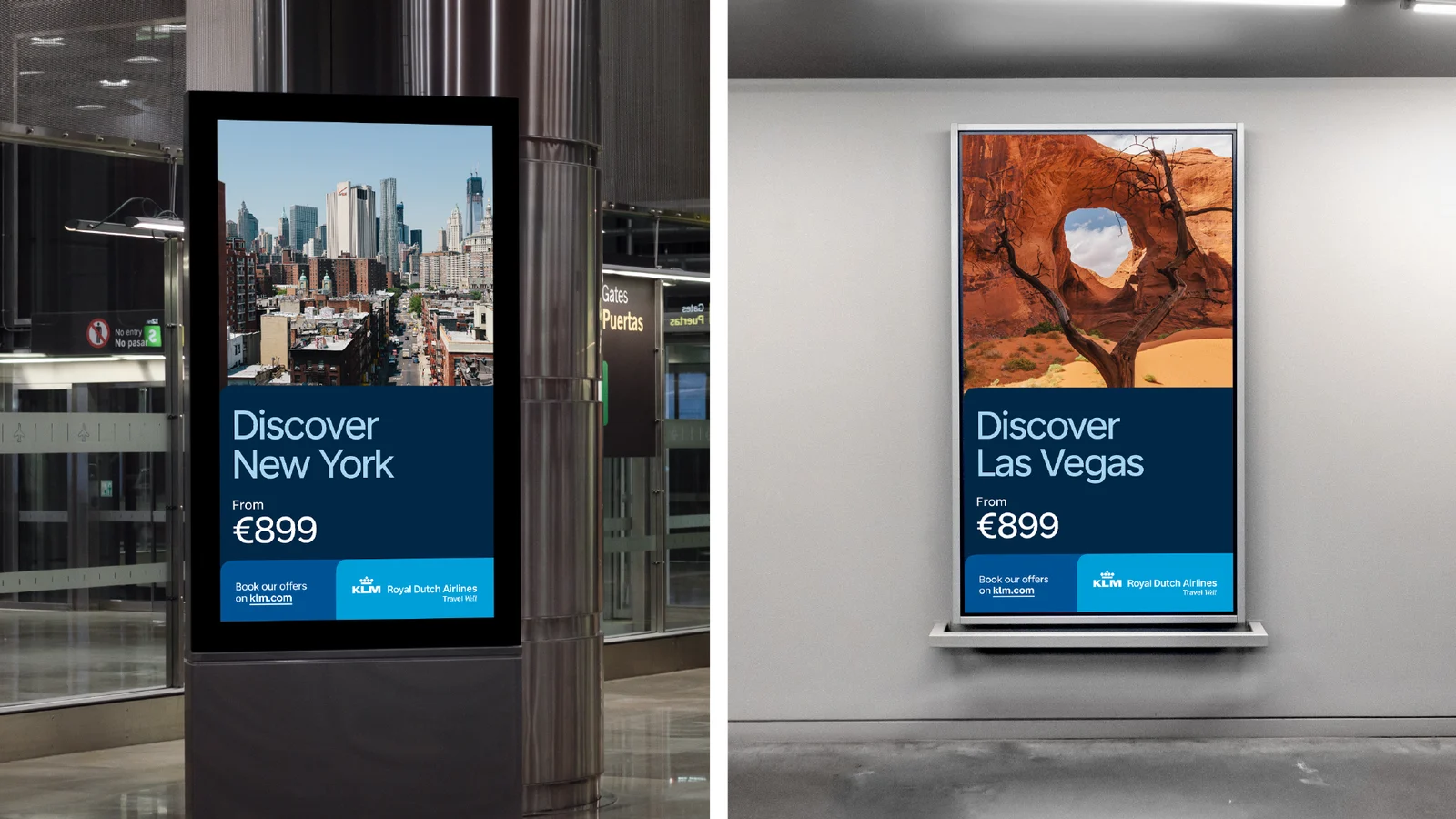
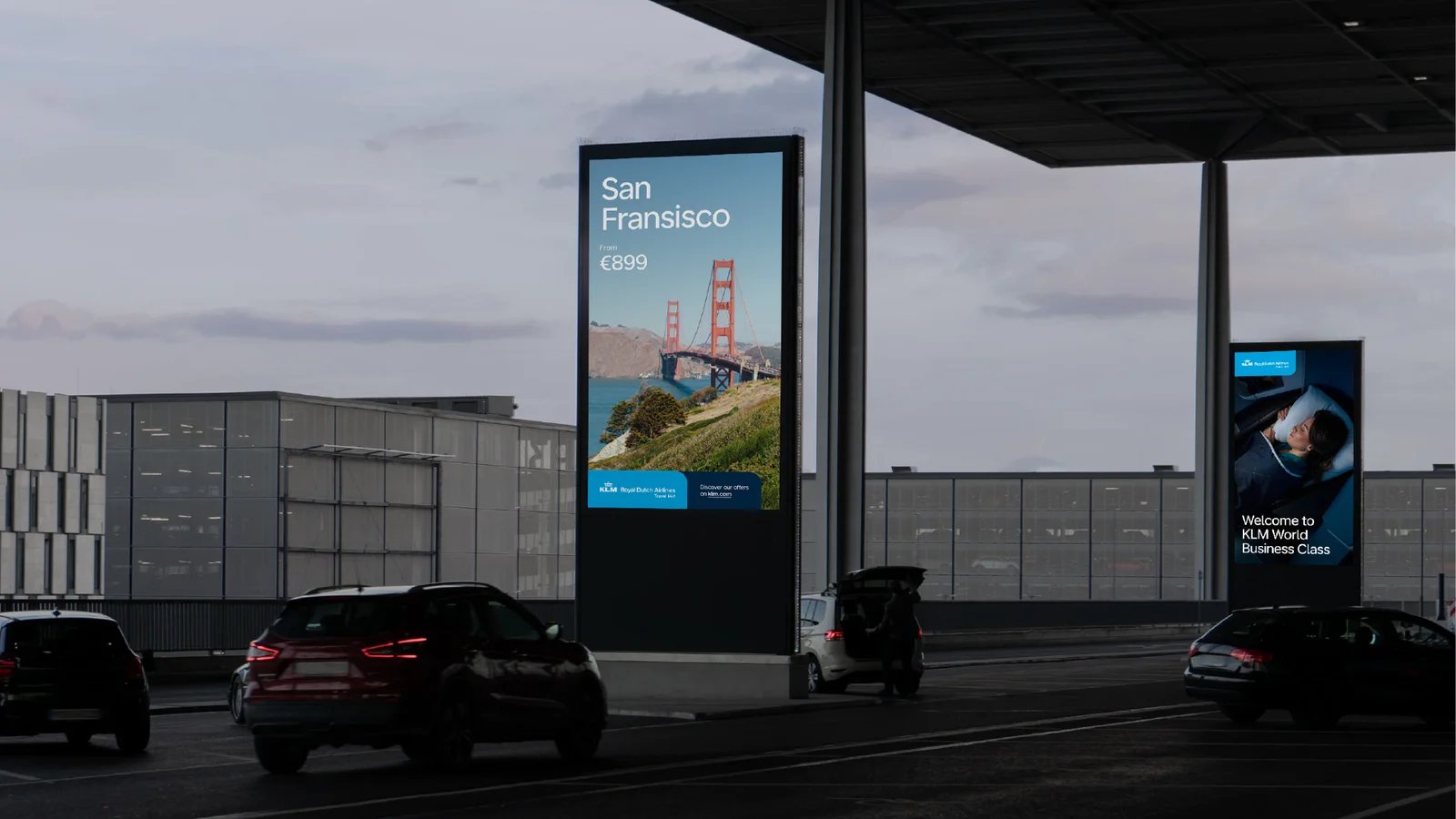
At this level, it is all about brand recognition: advertising across print and online media, social channels and displays at the airport. The blue panel and large, emotive photography lead.

Used in: logos, printed and online advertising, aircraft, the airport and merchandise.
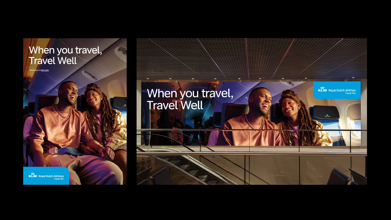
Travel Well campaign: travellers in the KLM cabin, shown in print and on screen
KLM destination posters for New York and Las Vegas in a stationKLM digital displays at the airport at dusk
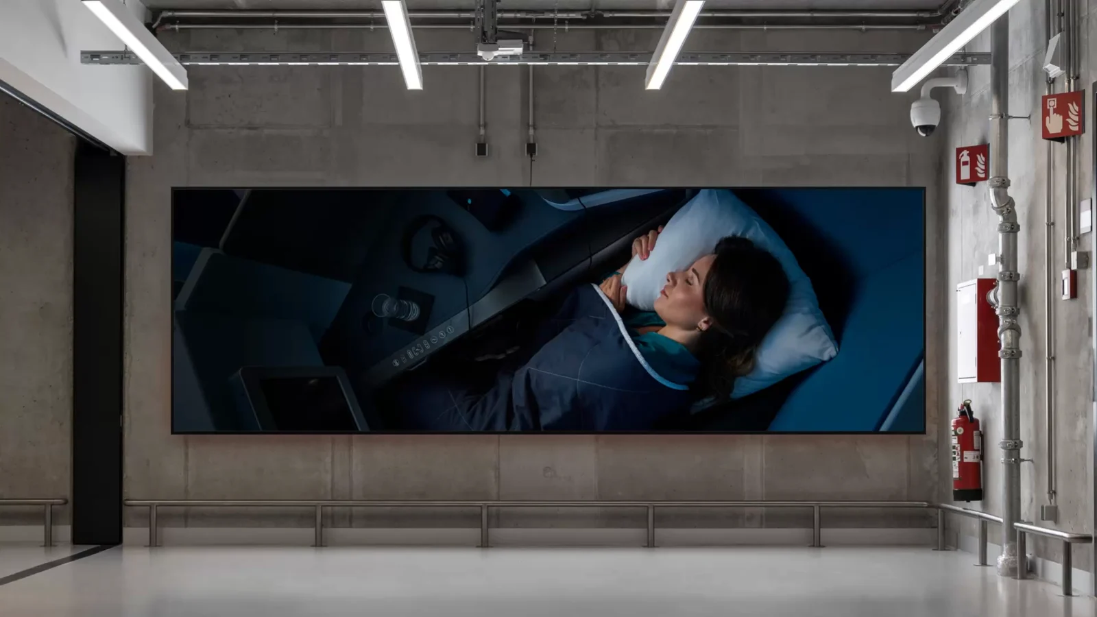
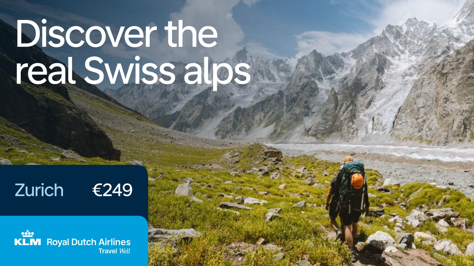
Large-format KLM World Business Class billboardKLM Discover the real Swiss Alps campaign

Level 2 — Participation

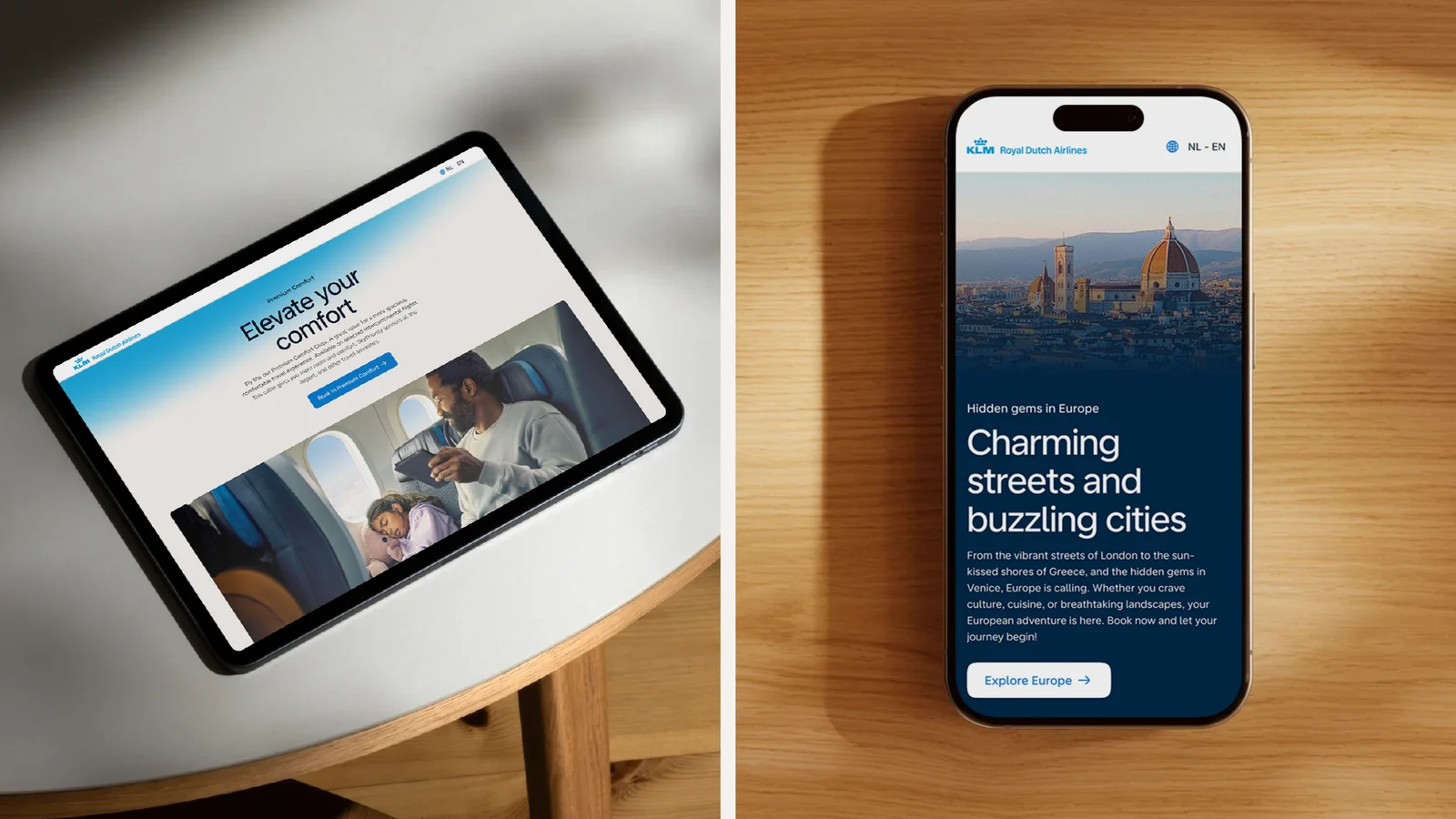
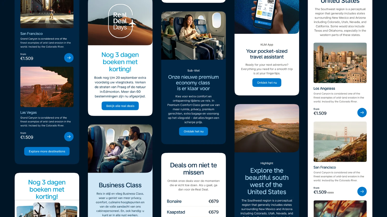
This is where people actively interact with the brand: in the app, on the homepage and landing pages, or in a marketing email. A gradient of KLM Blue keeps the brand recognisable while leaving room for content and choice.

Used in: marketing, landing pages, the homepage, kiosk screensavers and email campaigns.
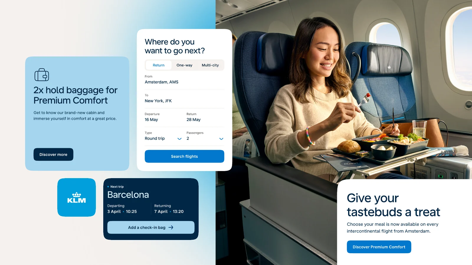
KLM homepage modules: flight search, Premium Comfort and next trip
KLM landing pages on tablet and phoneKLM marketing email modules

Level 3 — Functional

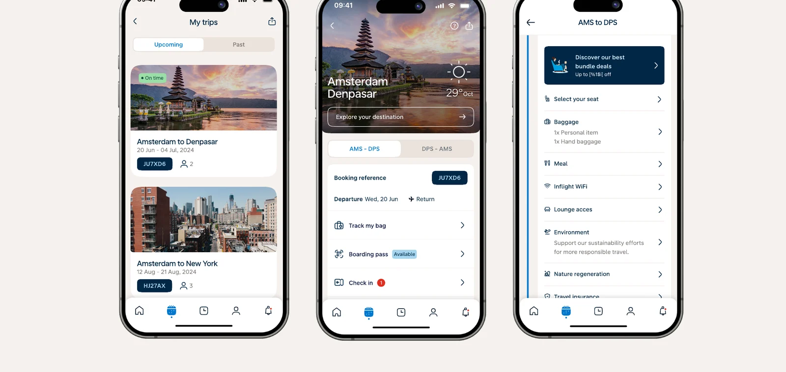
Here people are already engaged and trying to get something done: booking a ticket, paying for an upgrade, reading a service email or changing a booking. The brand steps back to typography and iconography, so the task always leads.

Used in: functional emails and conversion-driven parts of the experience, such as the booking flow and My Trip.
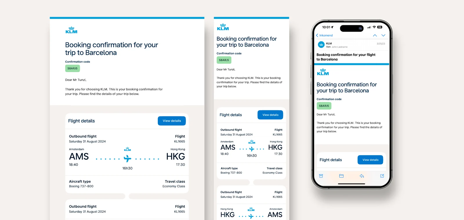
KLM booking confirmation service emails on desktop and mobile
KLM My Trip screens in the app
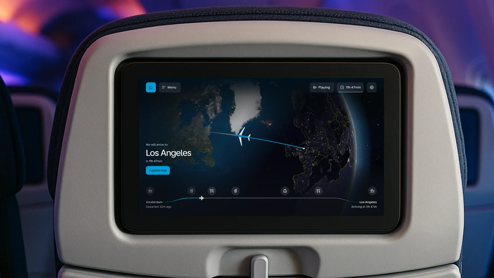
KLM inflight entertainment screen showing the flight map

Bold where it builds recognition, quiet where it helps people get things done.
Air France

Elevating our digital experience

Digital Experience Design Language

Client
Air France
Scope
Colour, iconography, shape, imagery and a working prototype
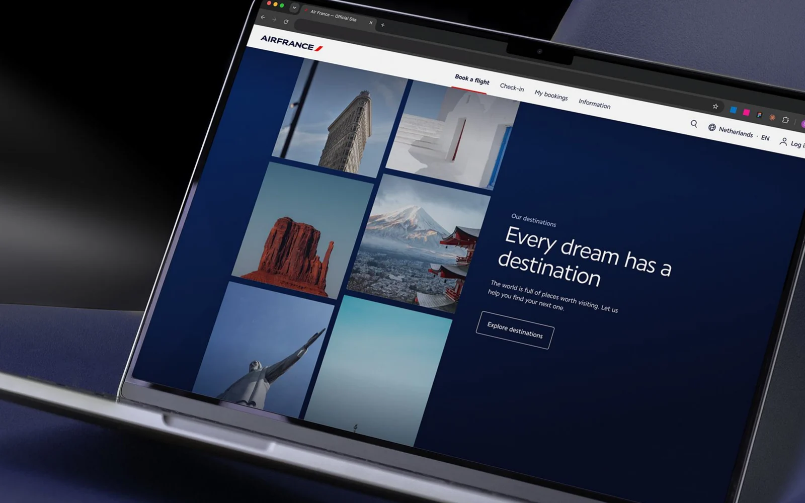
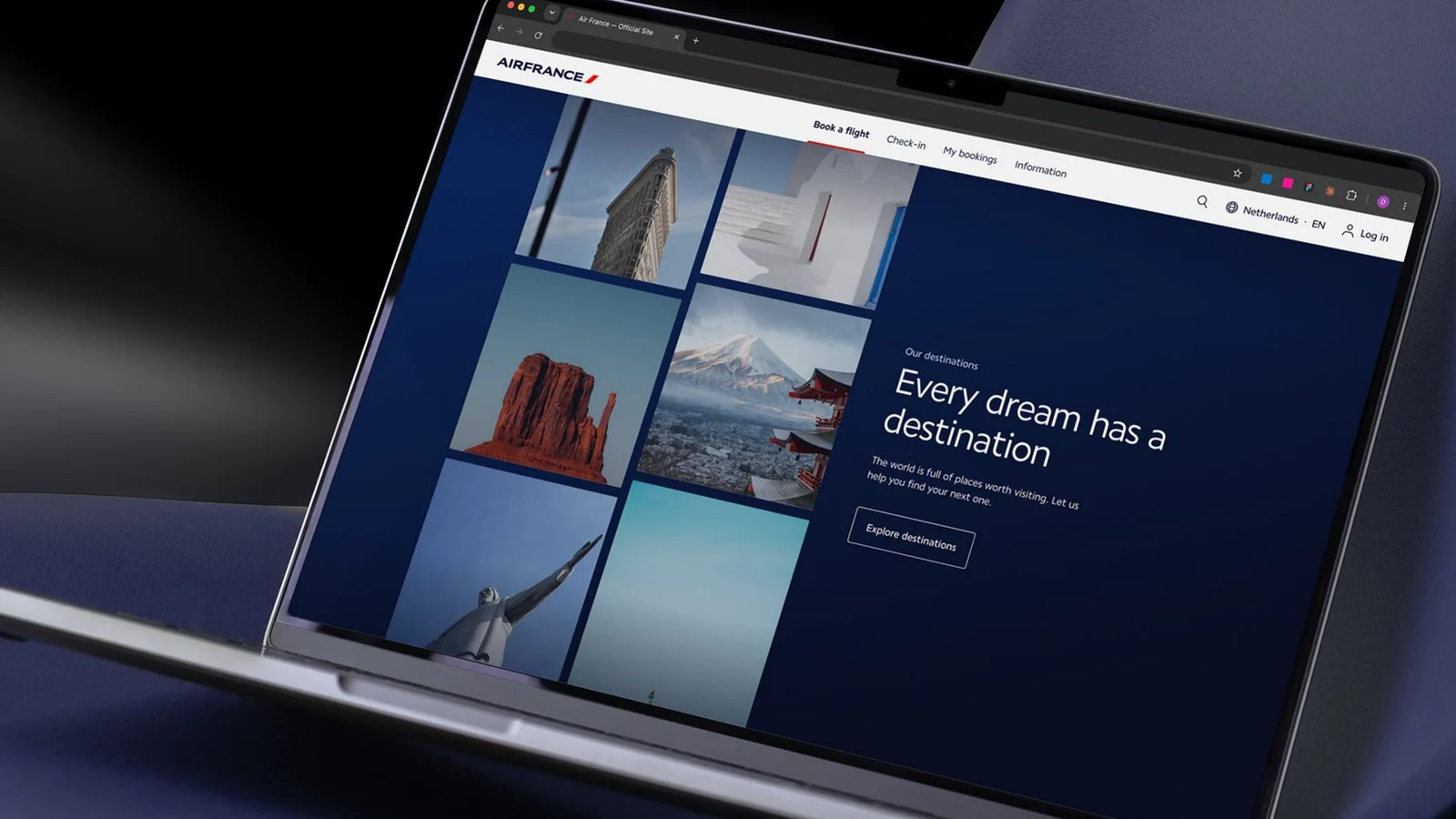
An Air France destination page, Every dream has a destination, shown on a laptop

Bringing the elegance of Air France, seen on the aircraft, in the cabin and in its campaigns, into every digital touchpoint.

The approach

Across a series of workshops with the Air France brand team, we evolved the foundational elements of the digital design language — colour, icons, shapes and imagery — reviewing each round together, refining, and testing it in a working prototype so decisions were made on real screens, not in isolation.

Colour

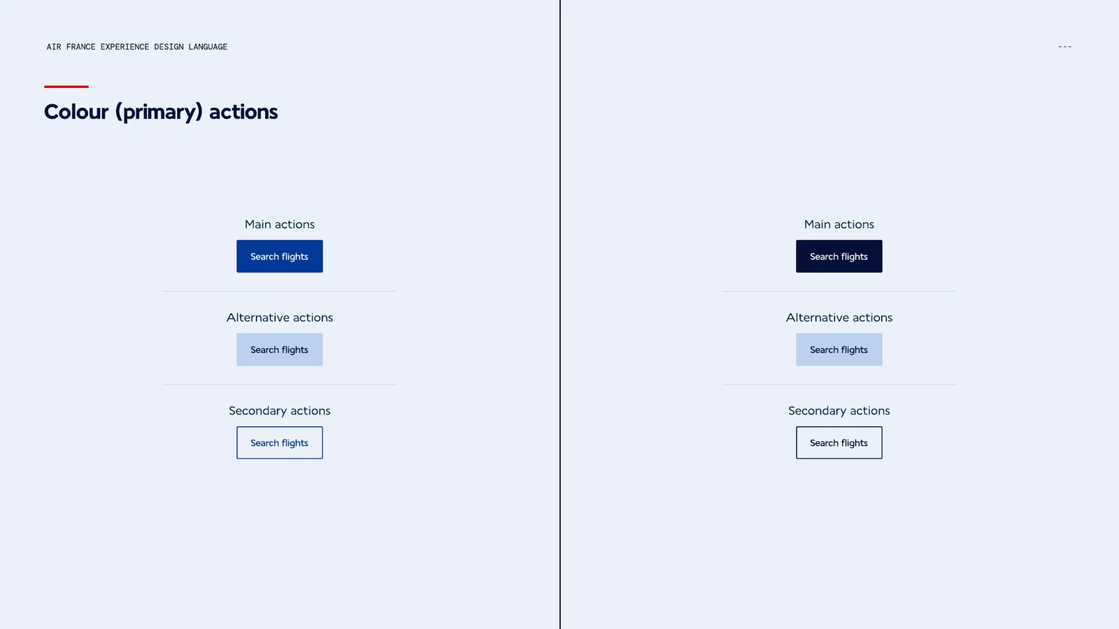
An updated palette with light and dark gradients, and a page balance that stays mostly light, with dark sections used to break the page and draw attention. The colour for primary actions was reviewed against every shade for contrast, keeping the most important actions unmistakable without feeling too vibrant.

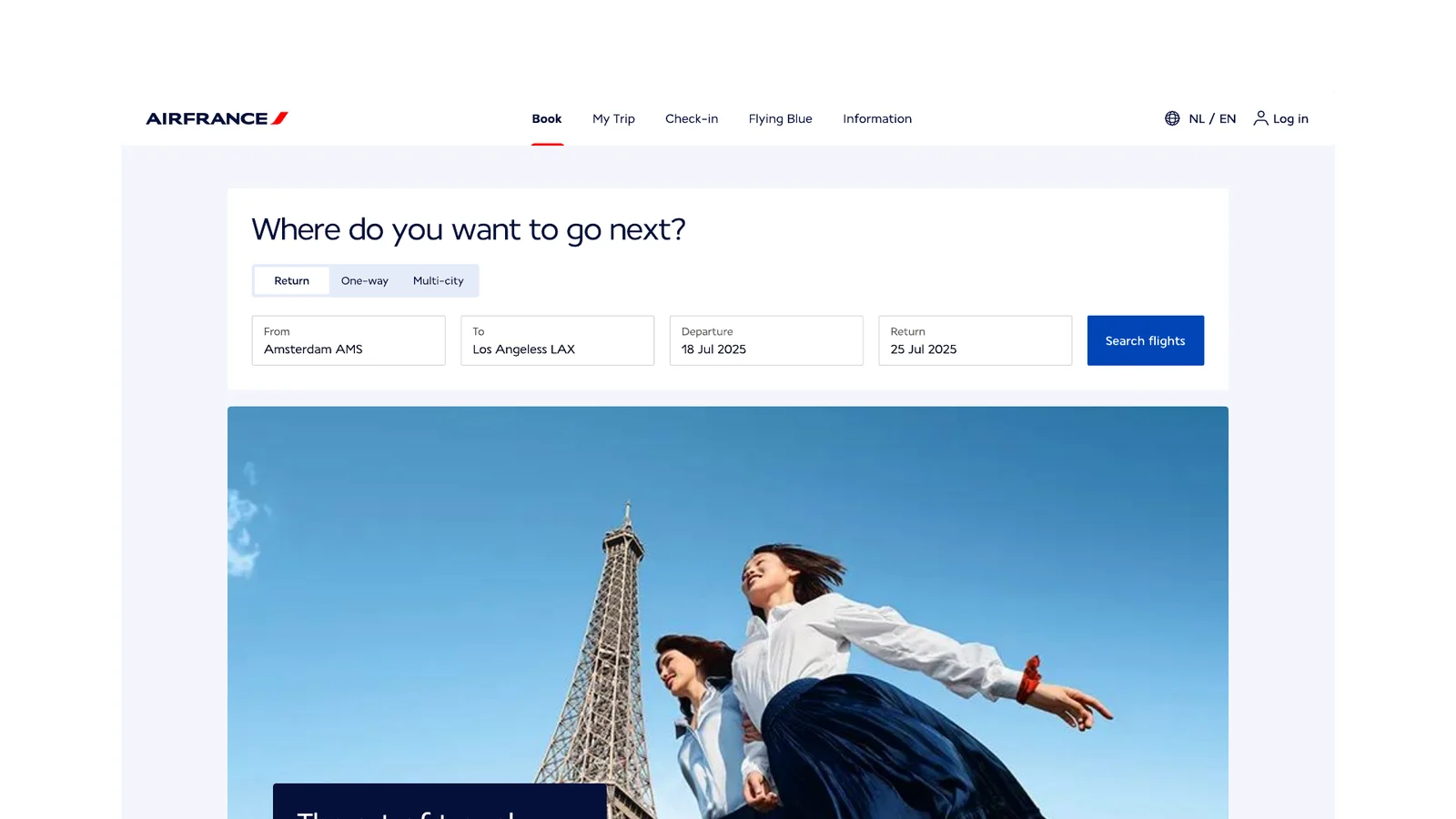
Primary, alternative and secondary actions compared in two colour optionsAir France homepage with flight search above campaign photography

Gradients for ancillaries

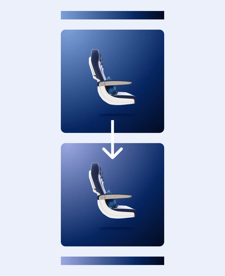
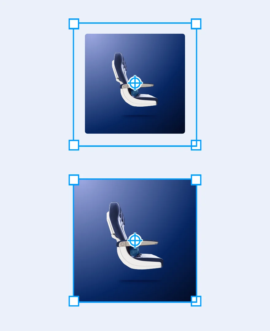
Ancillary imagery had gradients that didn’t match the palette, awkward overlaps and colour baked into images. We rebuilt it: a richer gradient with a subtle warmer light, tones taken from the palette, more space for the product and no overlap — so it can be coded as a component, with the gradient in CSS rather than in the image.
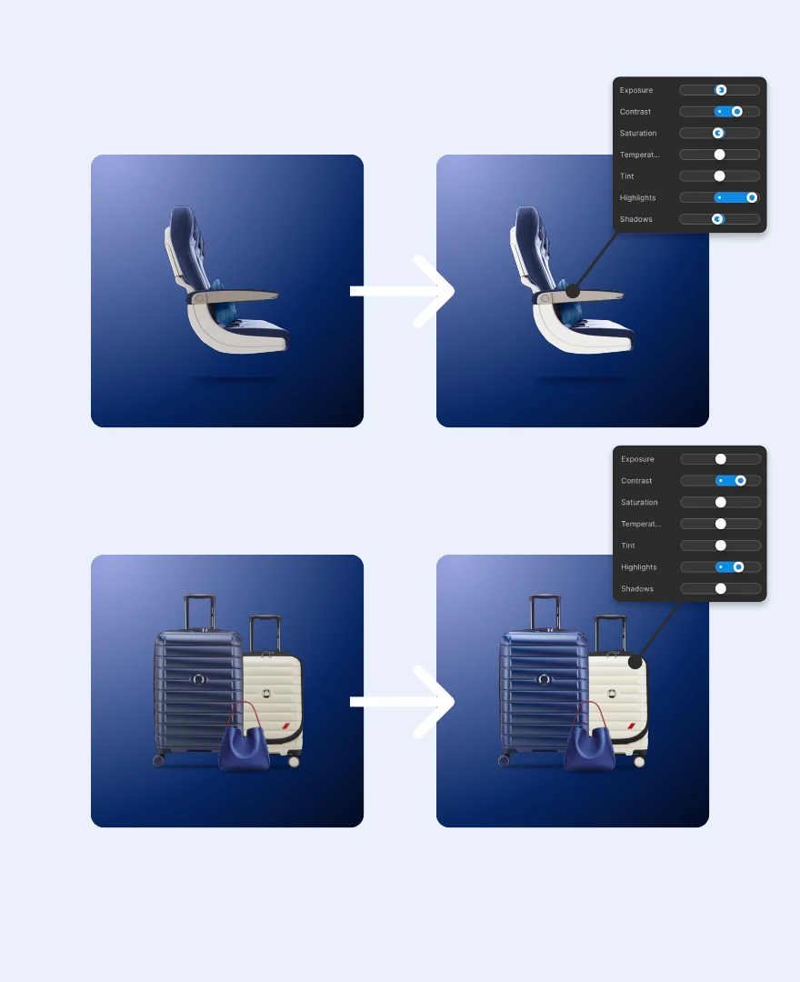
Every product cut-out is refined for hue, levels and contrast, so the assets pop and never look grey.
Gradient update with warmer light and palette coloursImage background with more space and no overlapProduct images refined to make them pop
A set of ancillary product images on the new gradient

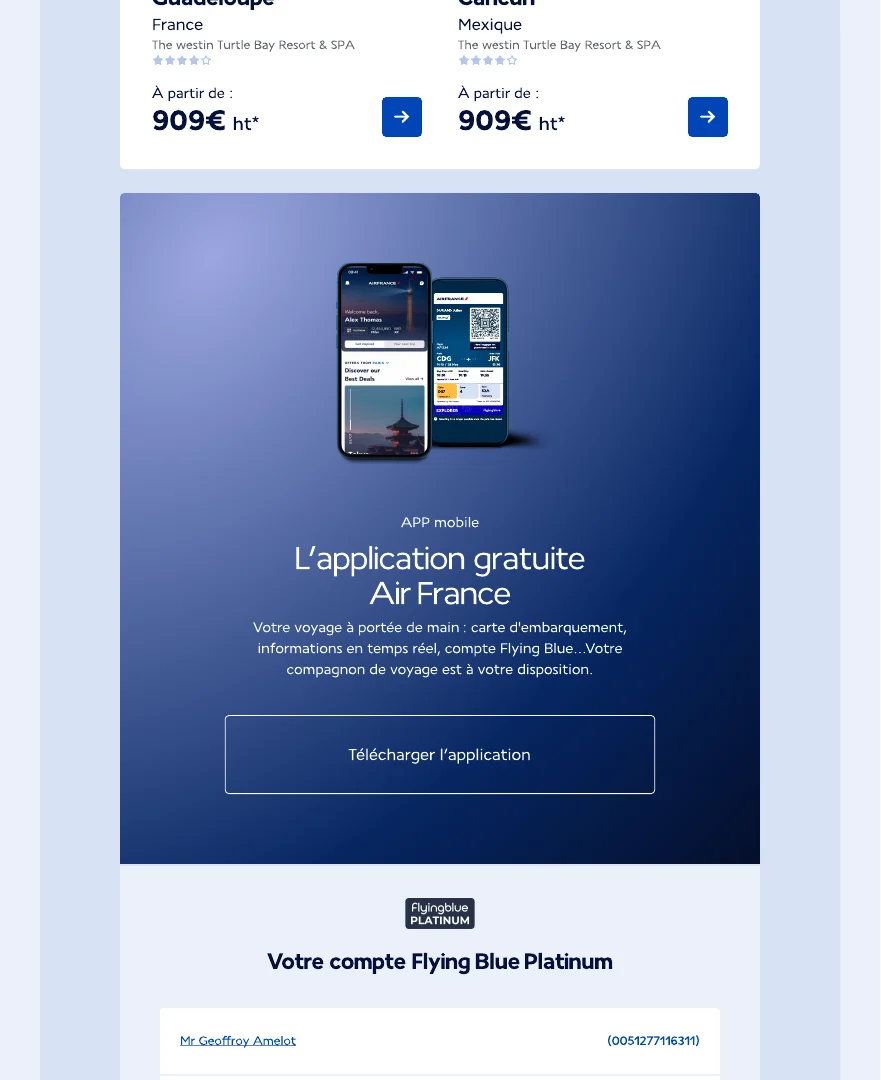
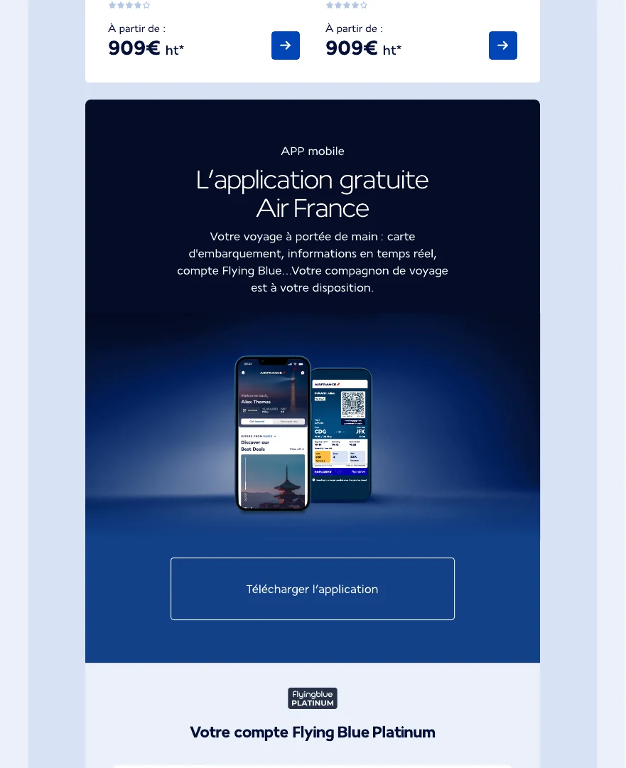
In use: marketing emails

The new gradient brings the kick: a premium feel with contrast, and an easy, scannable focal point. Light shines from the product.

Air France app marketing email on the new gradientAlternative email with light shining from the product

Icons with a touch of brand

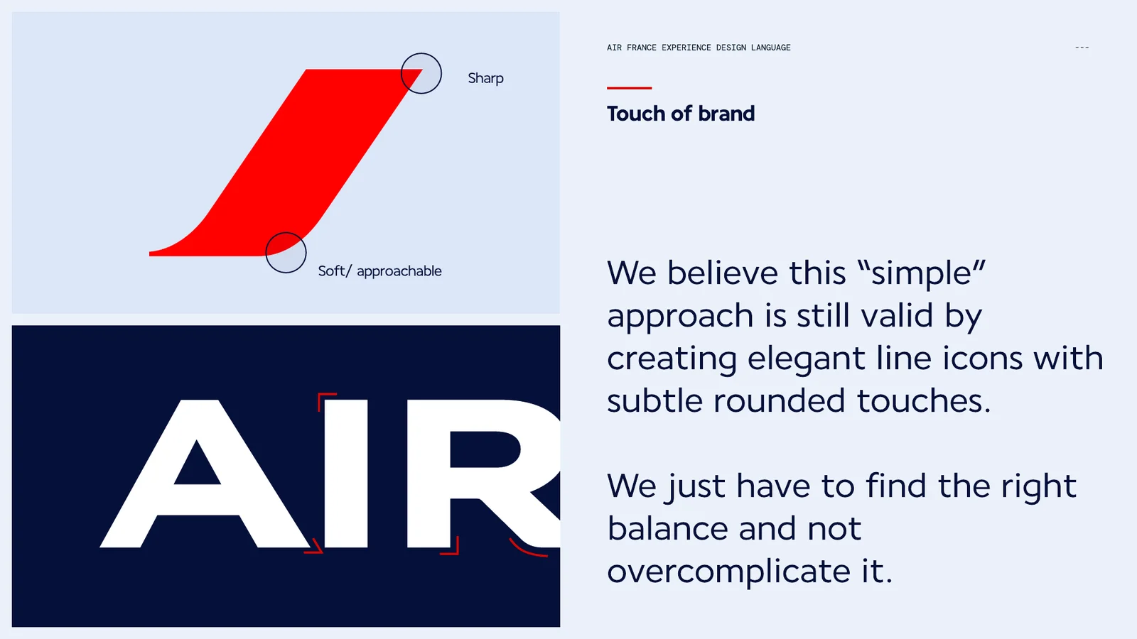
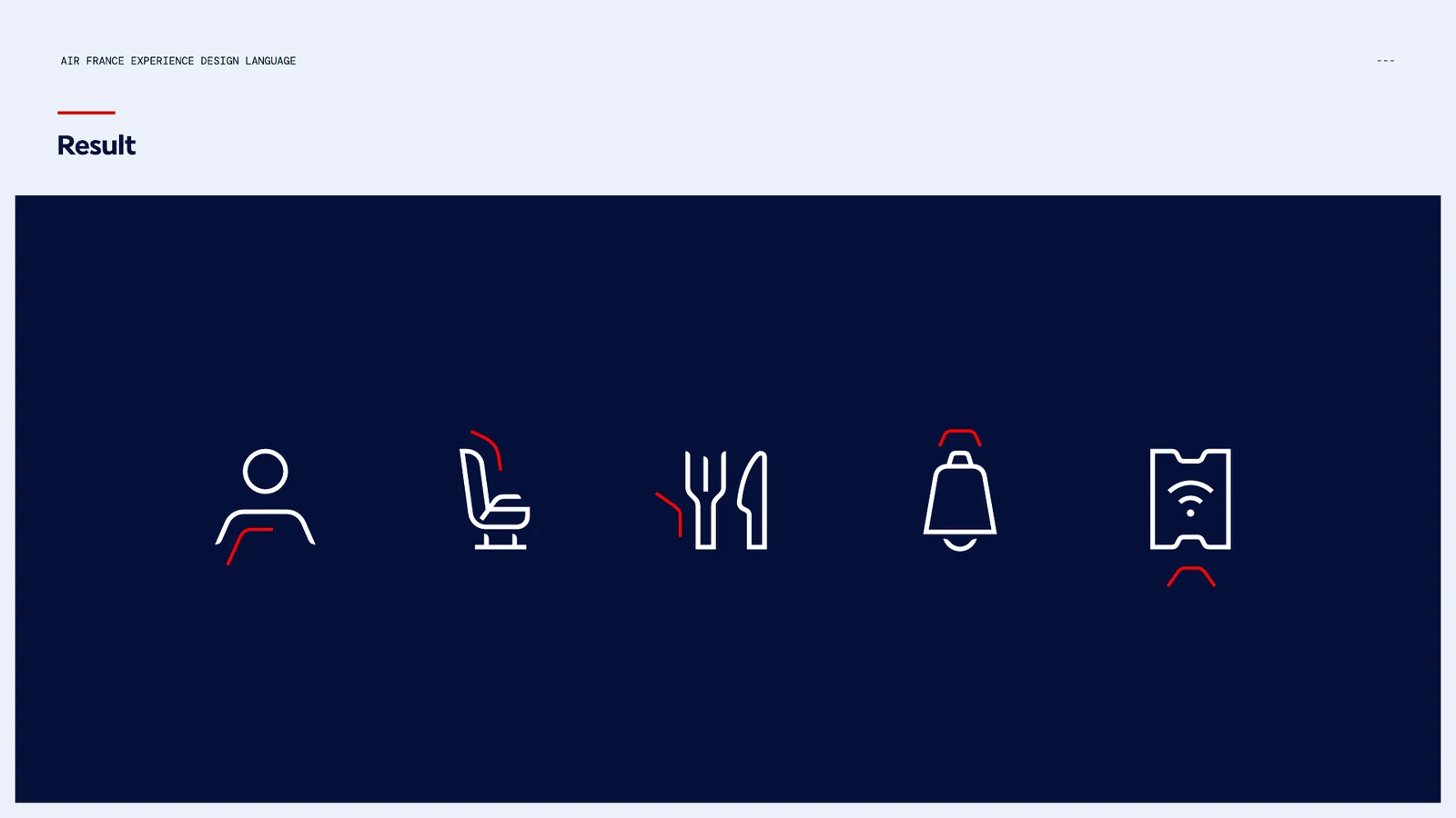
Elegant line icons stay the default, with a subtle brand touch: corners mostly sharp, combined with a roundness taken from the Air France accent. Not too playful, not too sharp — balance is key.

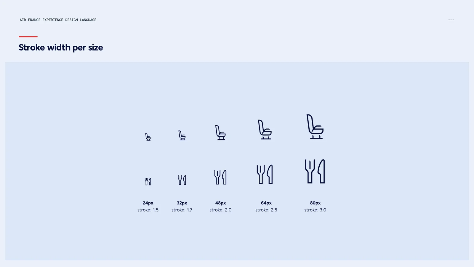
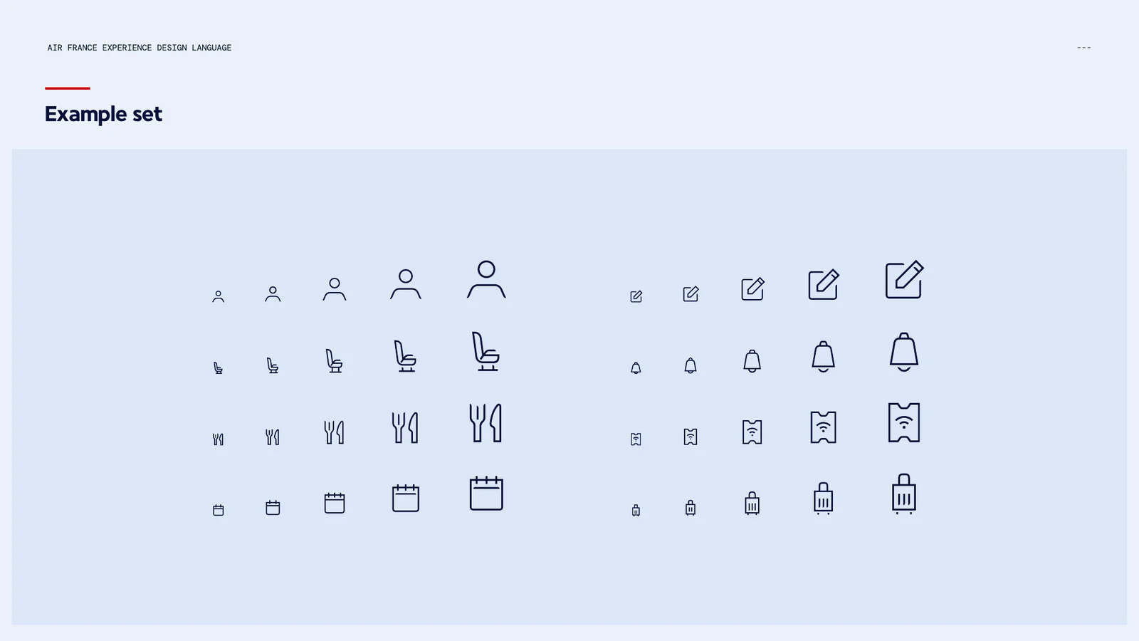
Every icon is drawn on one grid. Stroke widths scale from 1.5 at 24px to 3.0 at 80px, and detail is added as icons grow, from a basic form to negative space and a curved stroke ending at the largest size.

The Air France accent, sharp and soft, and the AIR wordmark
Final icons in white with red accent strokes on navy
Stroke width per icon size, from 24 to 80 pixelsThe example icon set across five sizes
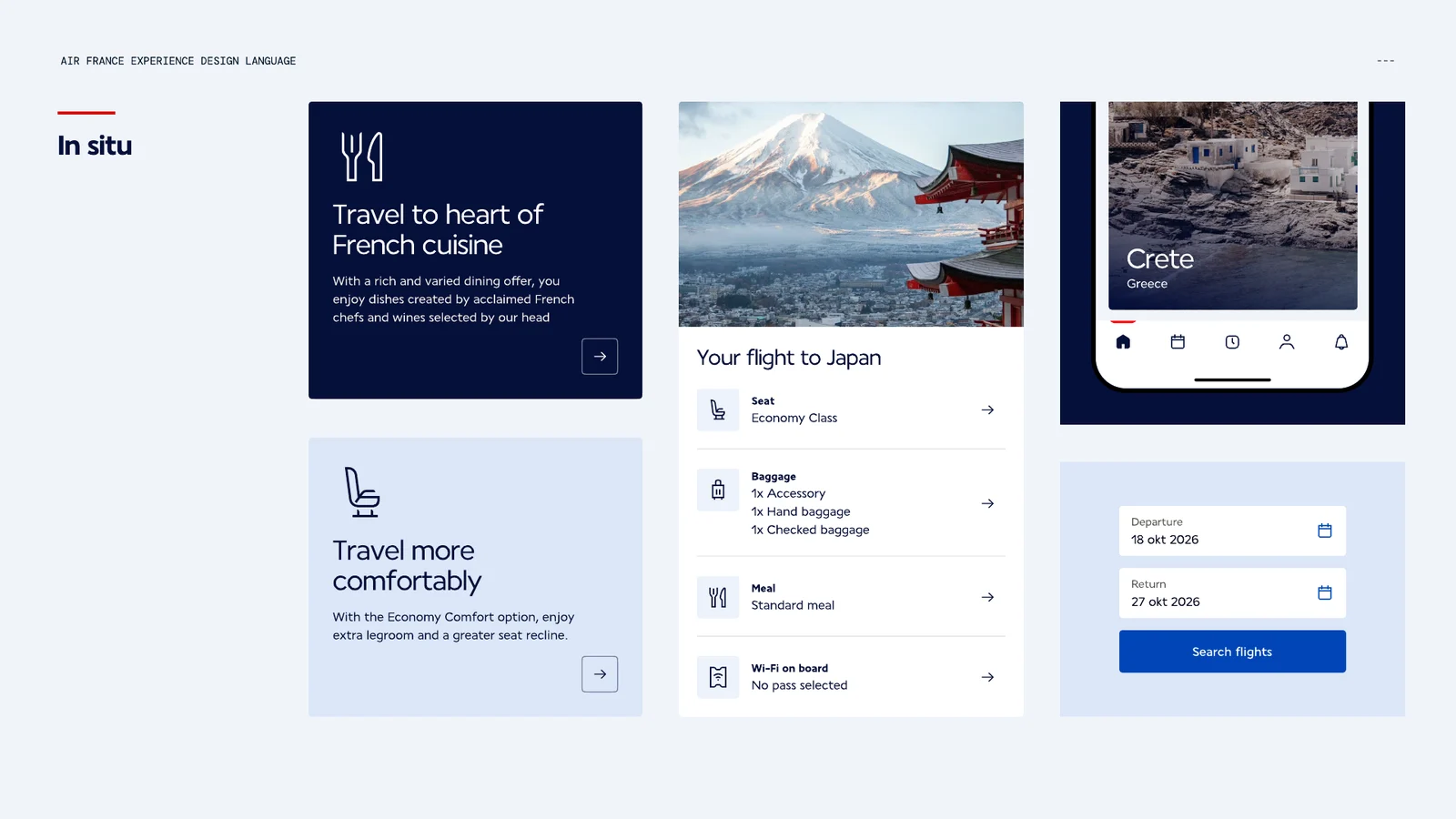
Icons in situ on cards and a booking screen

The accent

Across the aircraft, cabin, amenity kits and campaigns, the Air France accent marks moments of care and identity. In digital it can do the same: quietly orienting passengers, drawing attention to a useful next step and adding brand expression.

An outline accent is less visually heavy — a subtle extra touch of brand, used sparingly and lovely in motion.

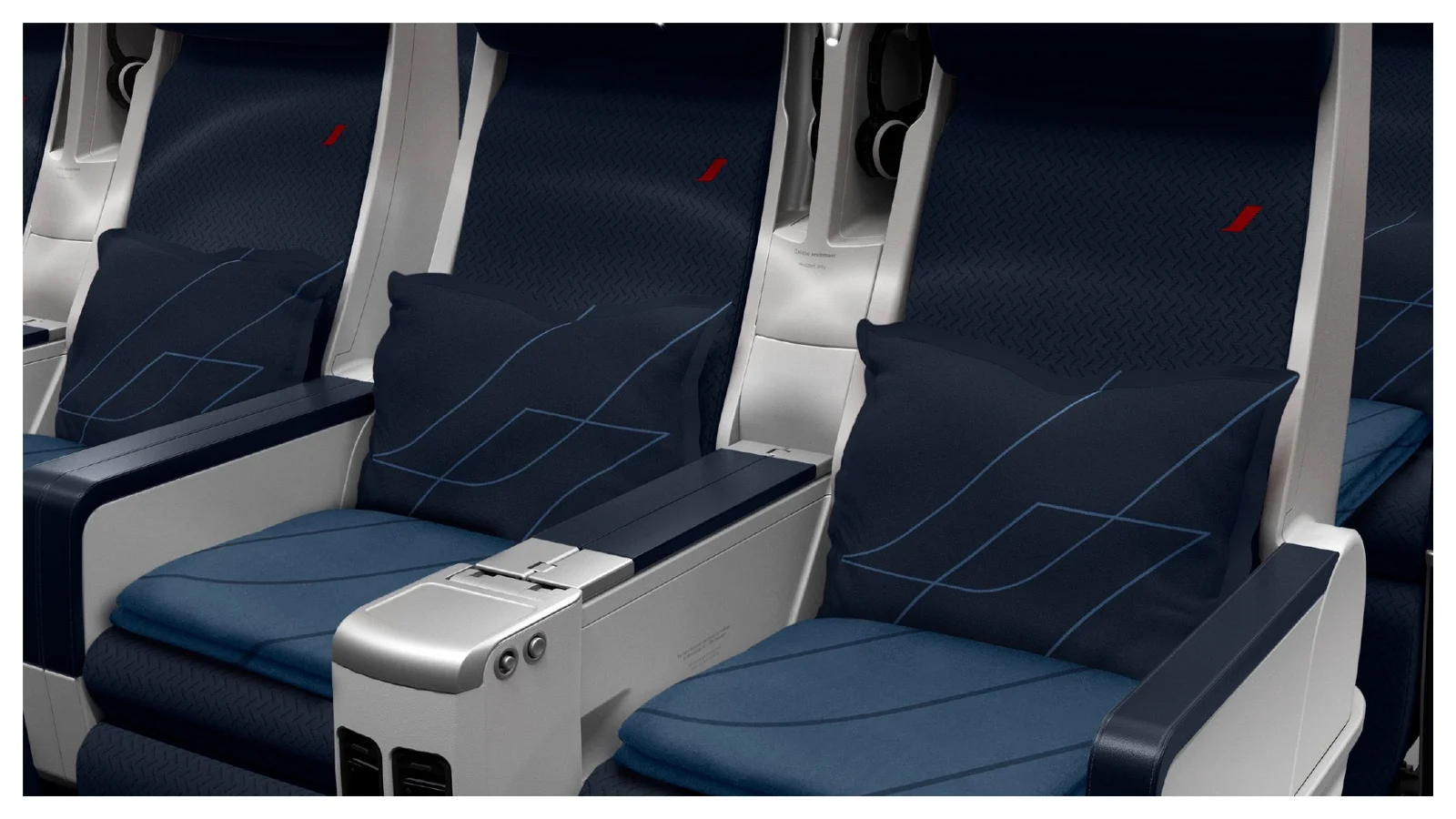
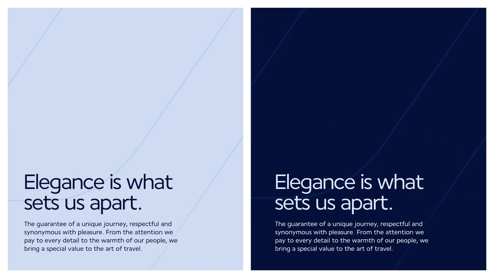
The accent stitched into Air France cabin seatsOutline accent behind the line Elegance is what sets us apart, in light and dark

Imagery

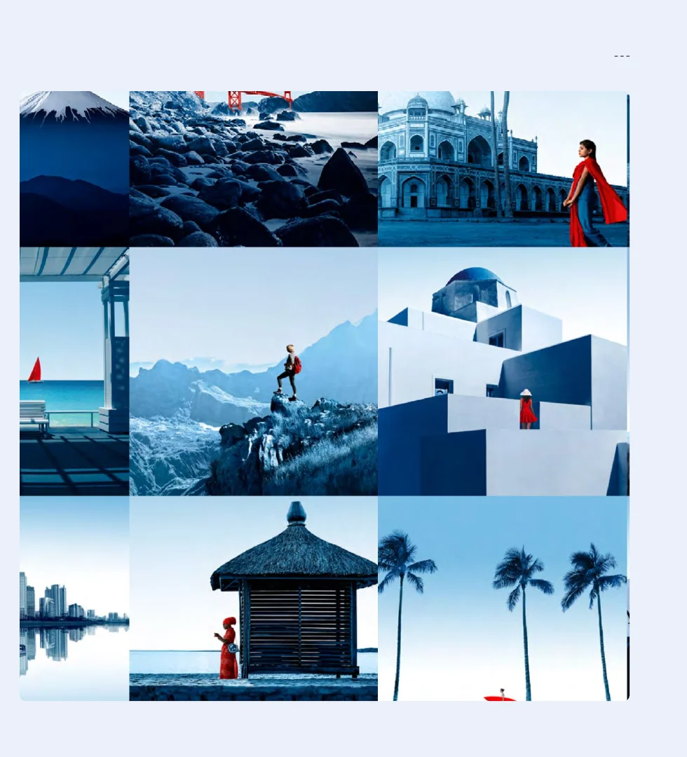
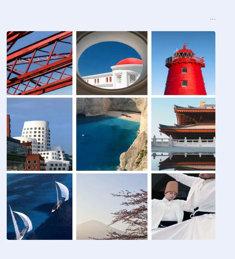
Two families of photography, aligned with the new brand imagery guidelines. Dreamlike visuals set the tone, limited to one per page at the first, header-level entry. Experience visuals complement them, with no usage limit.

Dreamlike destination visuals in blue tones with red accentsExperience visuals of destinations and details

Bringing it to life

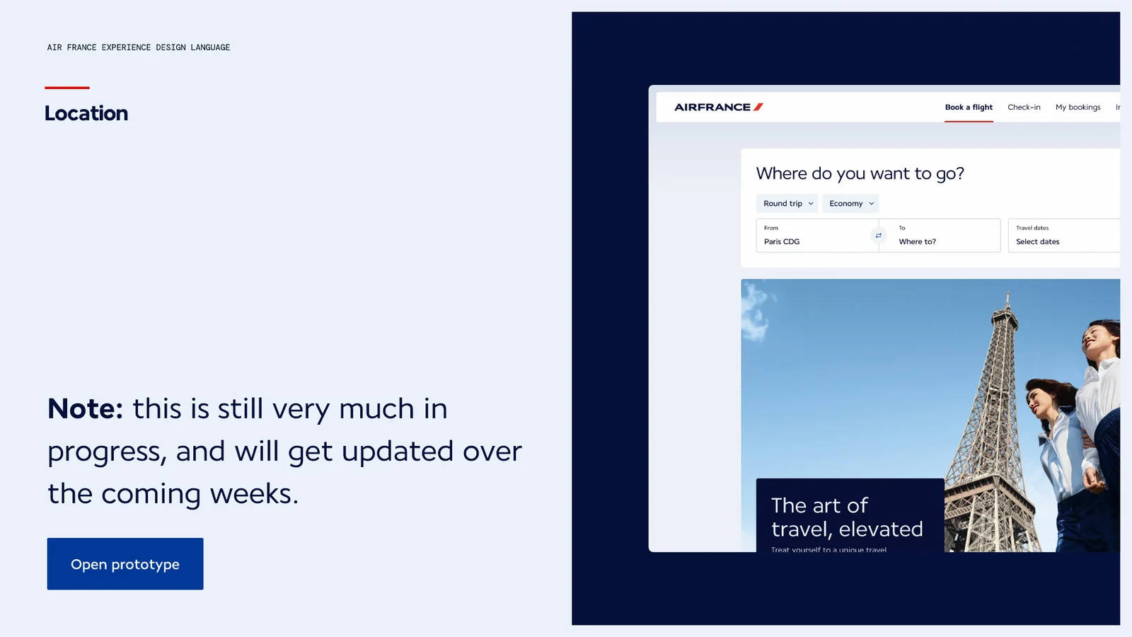
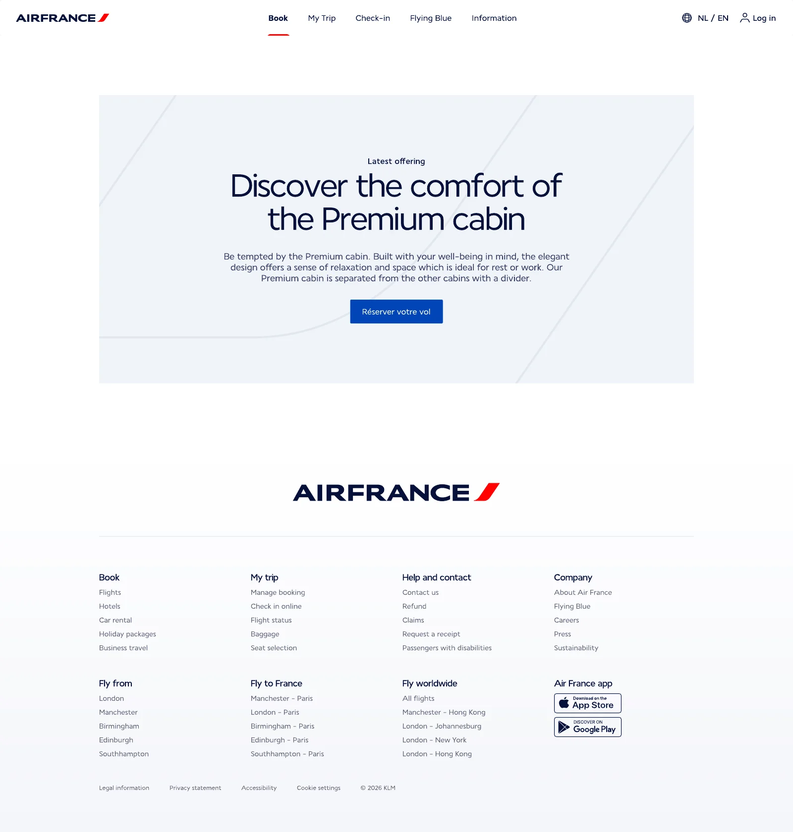
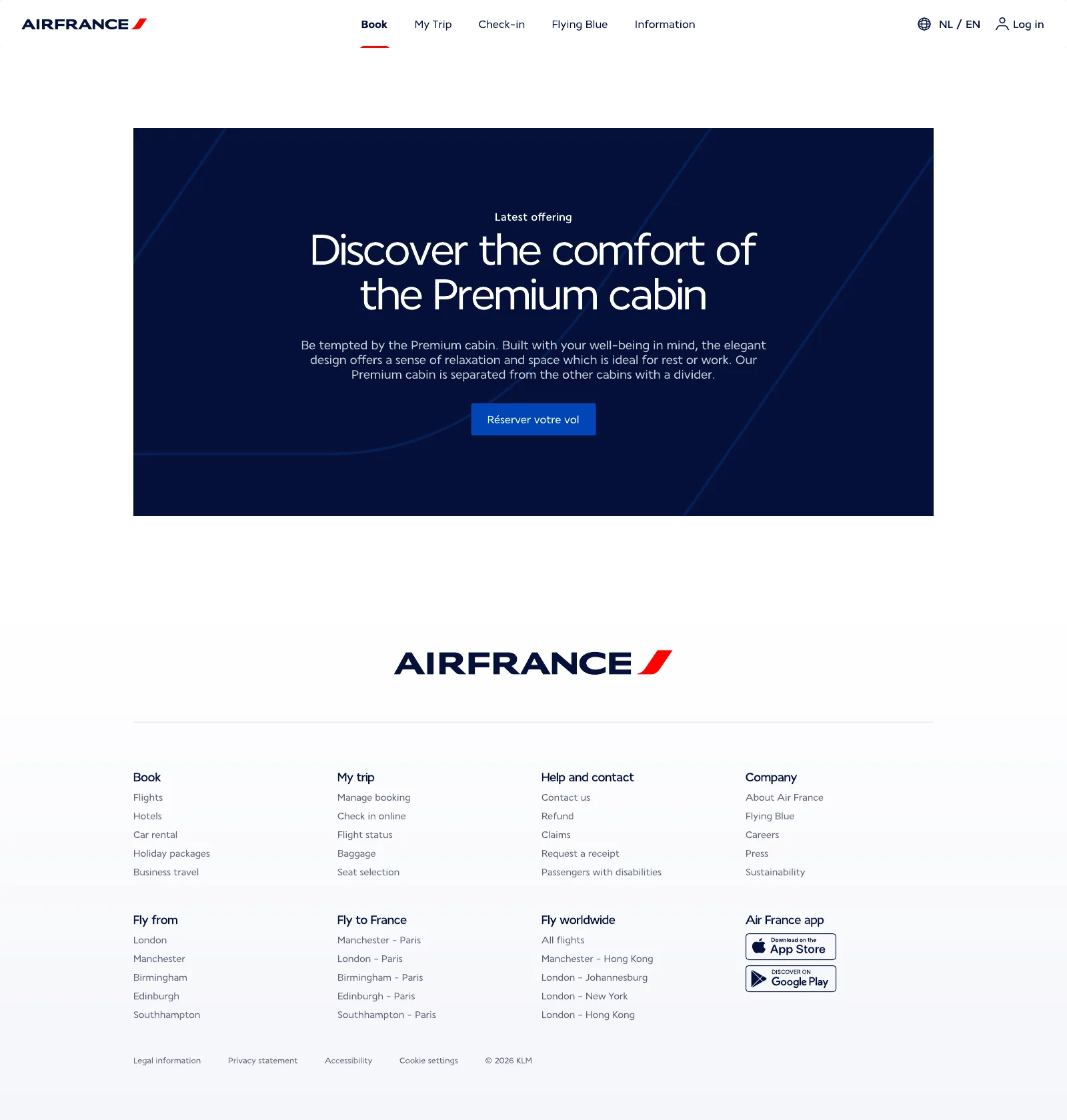
Everything comes together in a prototype — typography, colour, imagery, layout, icons and shapes — used as an environment to explore, test and showcase the language in context. Next: aligning typography and colour with the design system, and exploring more contexts.

Prototype homepage: The art of travel, elevated
Premium cabin promotion on a light panelPremium cabin promotion on a dark panel

Elegance is what sets us apart.

Air France

Every feature, before you fly

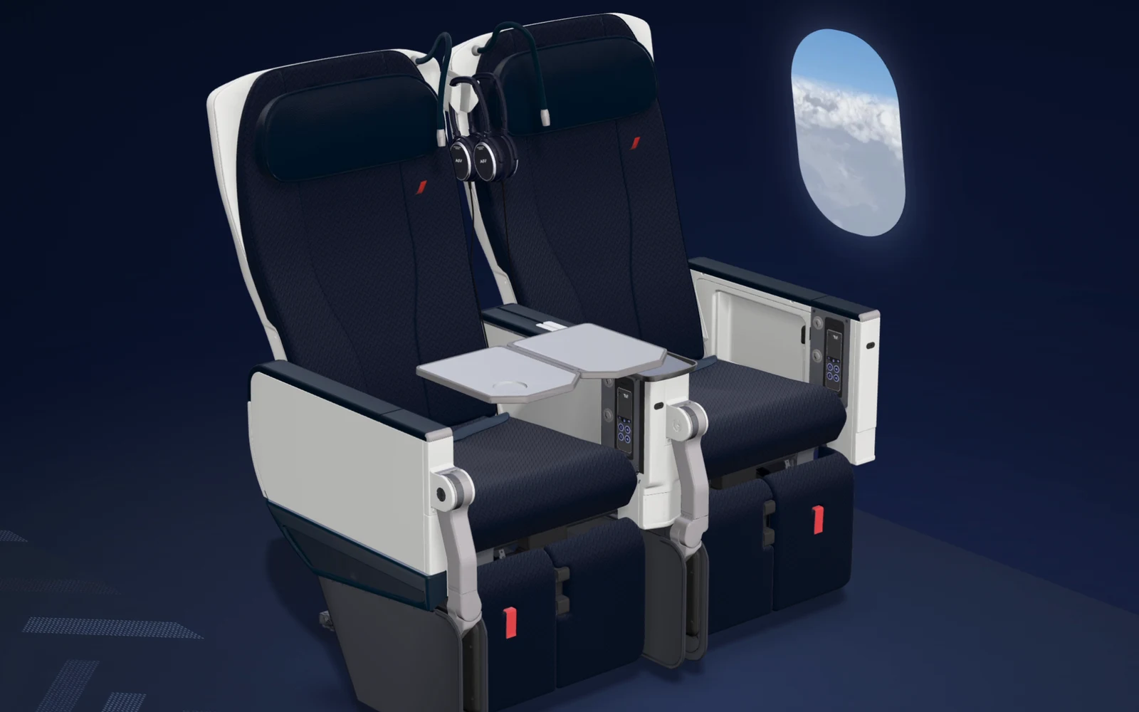
Discover Your Seat: an interactive Premium seat

Client
Air France
Scope
Premium seat, 13 features, in French and English

A premium seat is full of thoughtful details most travellers only discover once on board. This lets them try every one before they fly.

The idea

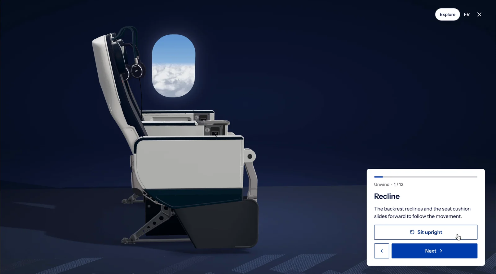
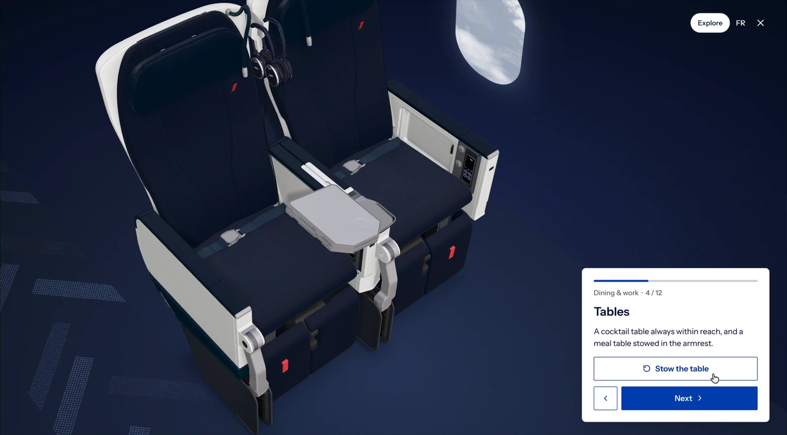
An interactive 3D model of the Air France Premium seat that people can turn, zoom and play with in the browser. Rather than reading about a feature, you press one button and watch the seat respond: the backrest reclines, the leg rest rises, the table unfolds. It turns a physical product into a digital experience that feels as considered as the cabin itself.

Try the prototype ↗

A guided tour

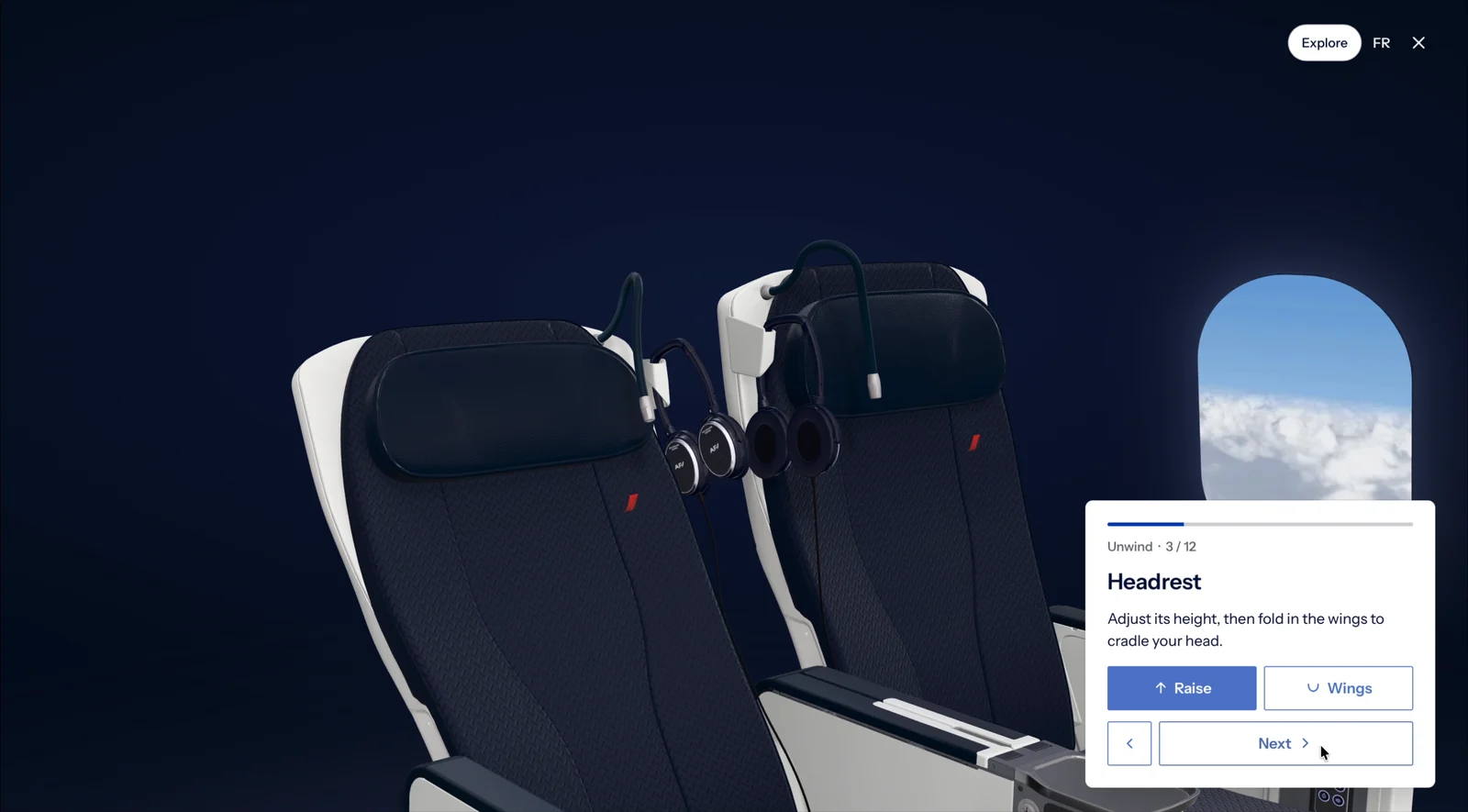
Thirteen features in short chapters, from Unwind to Dining & work, each with a single, clear action: Recline, Raise, Unfold the table. A progress bar keeps you oriented, and the tour ends with Relax mode, where one touch sets the recline, leg rest, footrest and headrest wings together.

The seat in recline, with the Sit upright actionAdjusting the headrest height and wingsThe meal table unfolded from the armrest

Explore freely

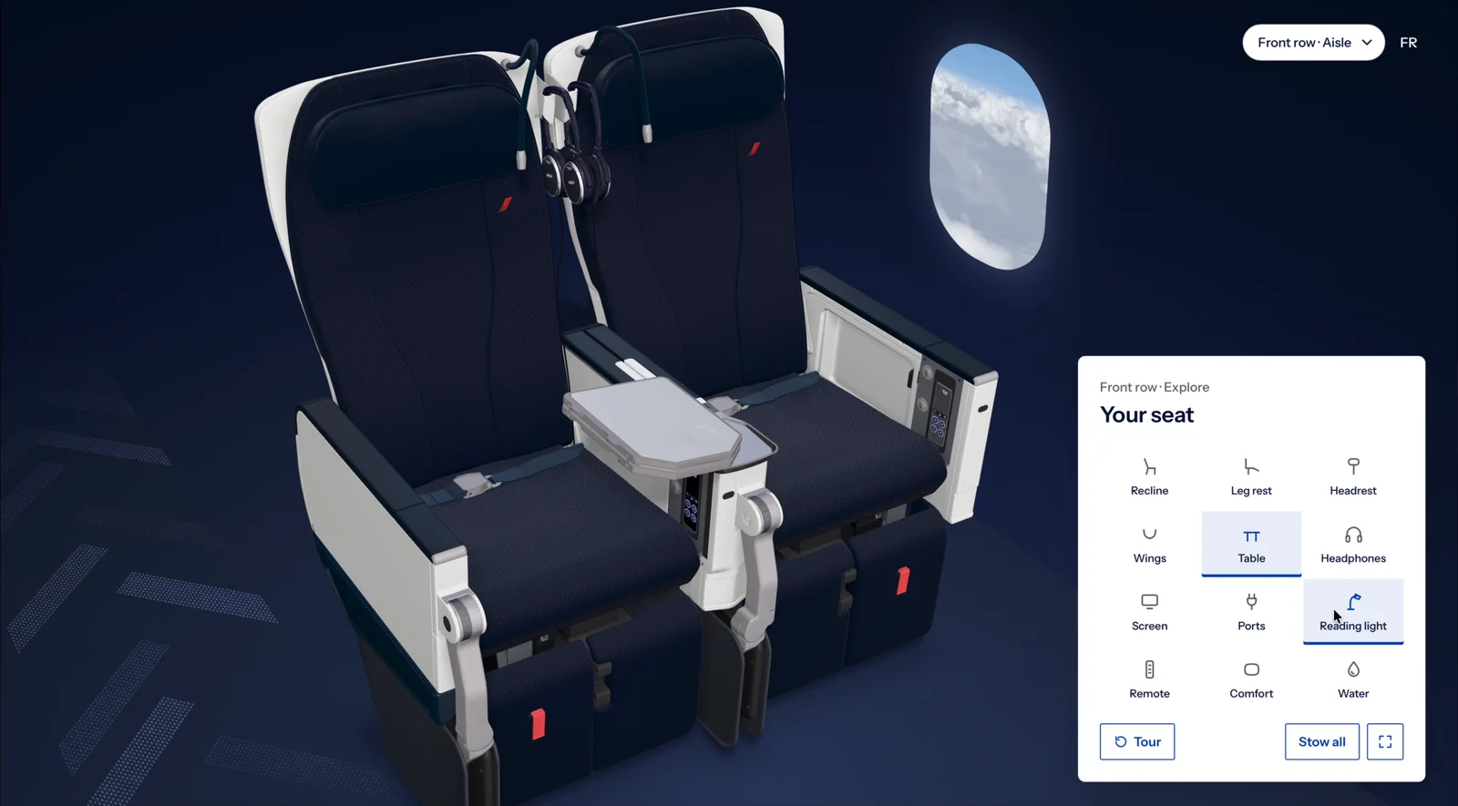
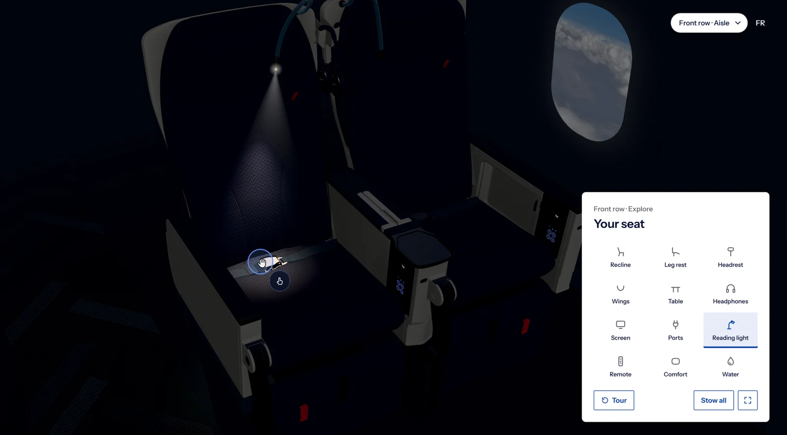
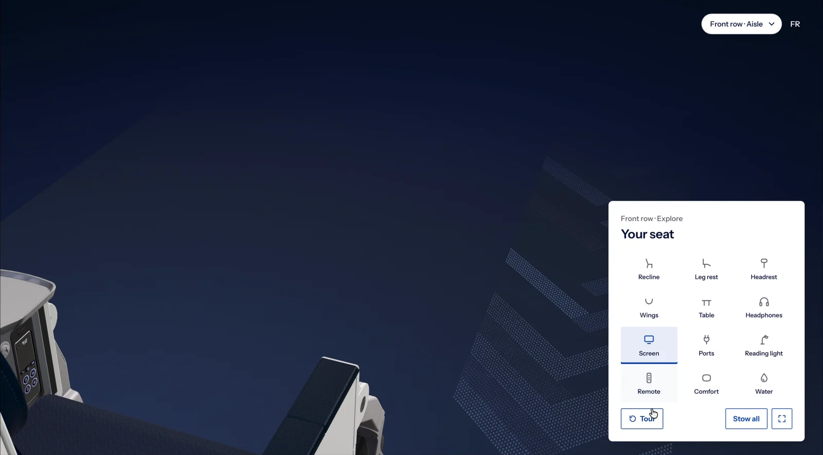
Or skip the tour and explore. Every feature is a single tap in one panel: dim the cabin to try the reading light, raise the touchscreen, plug in, find the remote. Drag to turn around the seat, pinch to zoom, or use the keyboard. Switch between a standard, front-row, window or aisle seat, in French or English.

The explore panel with every seat feature as a tapThe cabin dimmed with the reading light onThe personal touchscreen raised from the armrest

From recline to reading light, try it yourself.

British Airways

The World of Flight

Digital Brand & Experience Design Language

Client
British Airways
Scope
Brand direction, design language, motion, experience vision

A single, flexible design language for every British Airways digital experience — with its own approach to physics, interaction and navigation.

The objective & opportunity

Raise the level of the British Airways digital experience across the board, create visual and experiential consistency across every platform, and define a practical set of guiding principles for future digital experiences — whether on screen, in virtual reality or even on the roof of Terminal 5.

The vision

Connect the dots across all of BA’s current and future digital work: show how the experience translates holistically across touchpoints and devices, and how BA responds to pain points and nuances within different journeys in thoughtful, intelligent ways — galvanising teams, removing silos and connecting design thinking.

A three-minute film brings it to life through one family’s trip to Madrid: dreaming and planning together, a shared booking, choosing seats, boarding passes and finding the gate, help from a conversational assistant when it’s needed, and a warm welcome home.

Typography

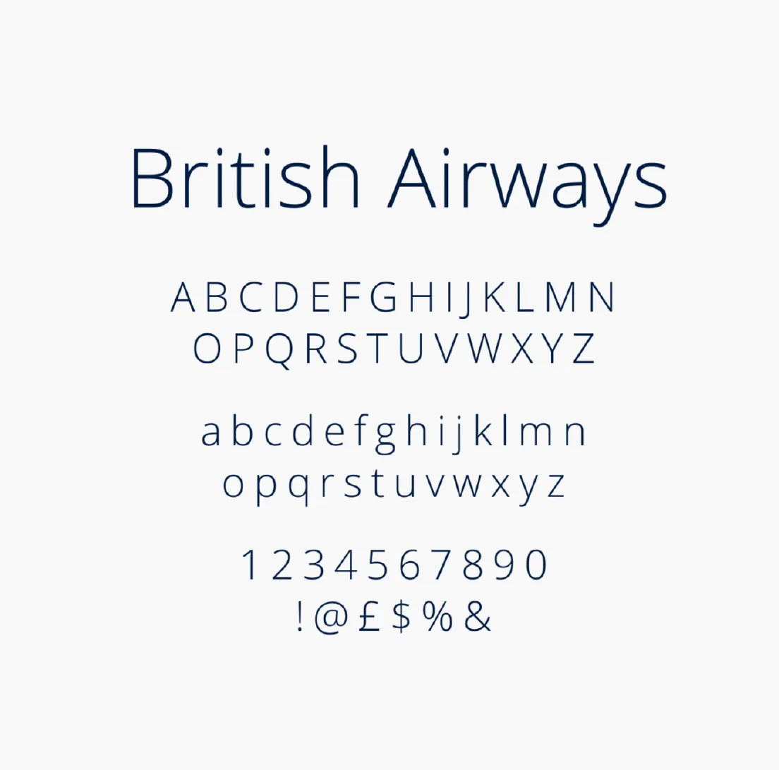
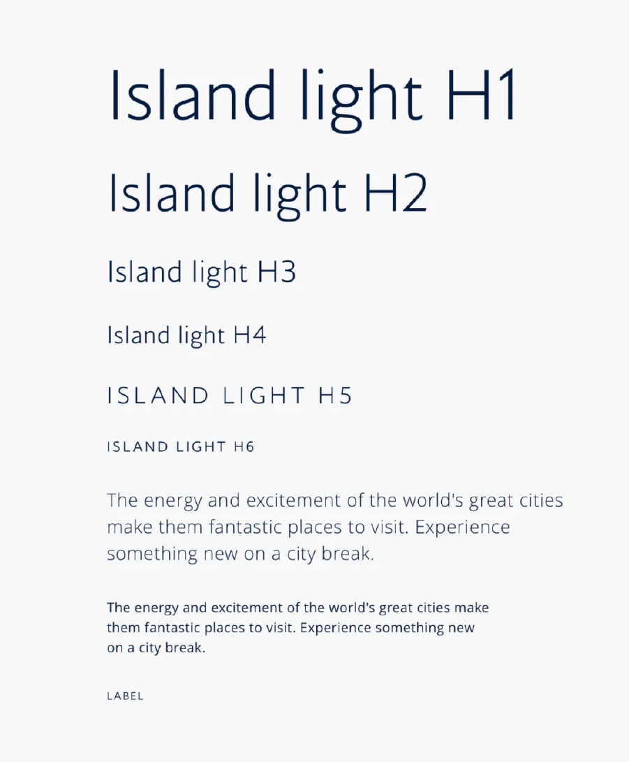
A visual expression of the British Airways brand voice, typography is an instantly recognisable brand asset present on every digital touchpoint. Type sizes are set as percentages of the body copy, creating a clear information hierarchy that flexes across any application.

British Airways typeface specimenBritish Airways type scale from H1 to label

Iconography & illustration

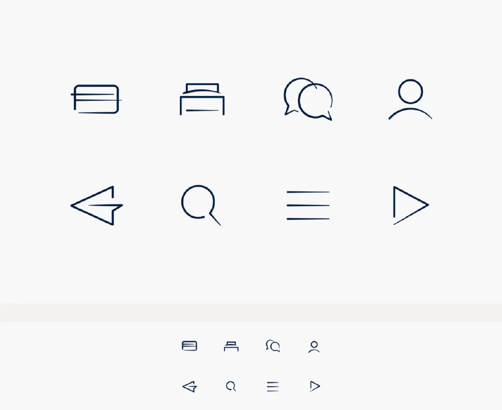
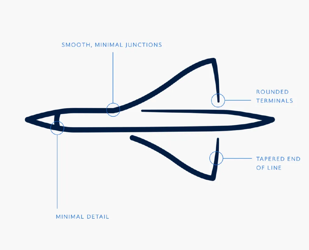
Icons and illustrations share one drawing approach: lines finish with rounded terminals and taper towards the end, and curves are kept as soft as possible.

Illustrations respond to their context and come in three sizes — small, medium and large — gaining complexity and detail as they grow, while always being treated the same way for consistency.

British Airways interface iconsAnnotated aircraft illustration showing rounded terminals and tapered lines

Art direction

Photography creates a sense of wonder through three principles:

1. Insider experiences

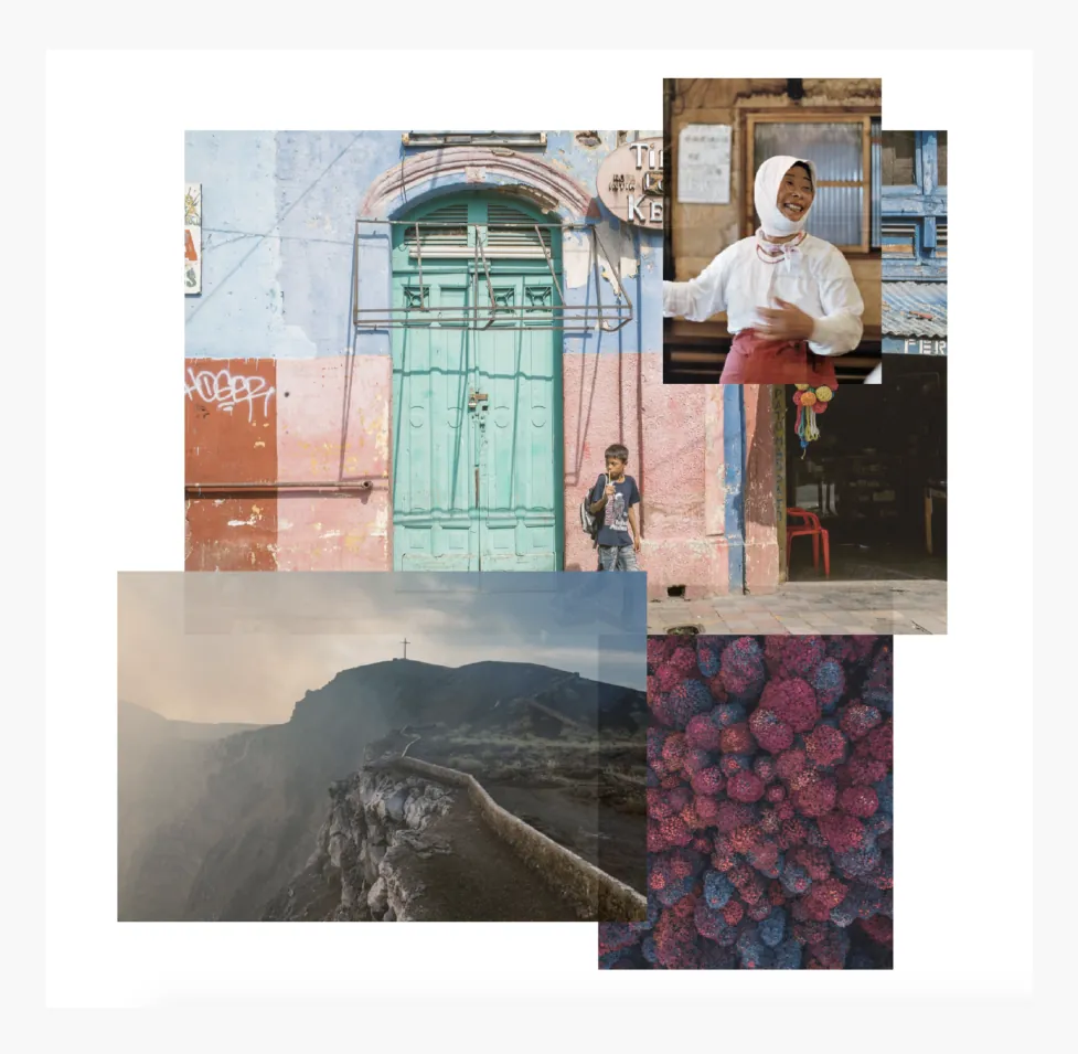
Hero the stories of people who know destinations best — experts and locals documenting what really makes a place, not just what the postcards show.

2. New perspectives

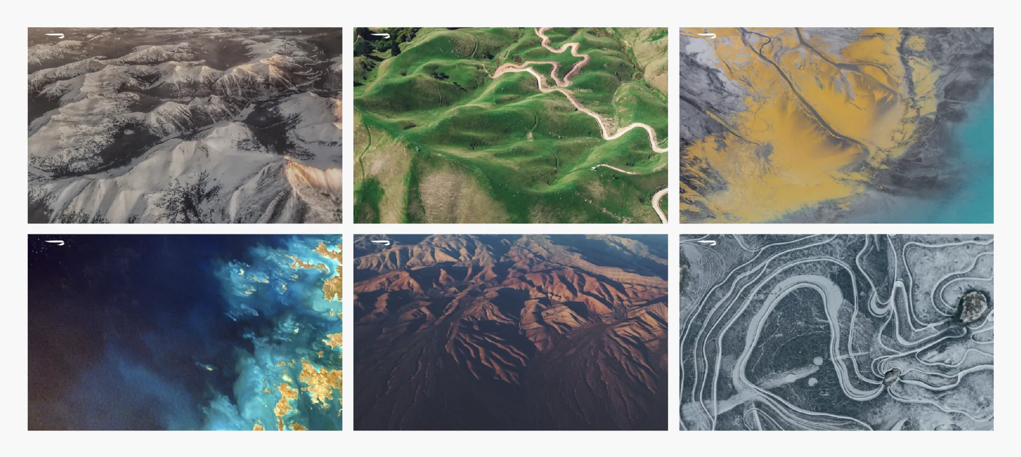
Show people an angle they wouldn't find anywhere else, from a distance and right up close, but never predictable.

3. Find the wonder

The world is full of amazing experiences and fantastic people, and the imagery celebrates this.

Art direction moodboard of insider travel photographyGrid of aerial landscape photography

Motion & transition

Velocity curve. Every animation uses the same velocity curve, for scale, movement, opacity and blur, so the whole experience shares one interaction feel.

Transitioning to content. When a link is clicked, a piece of the page's content is carried through to the next page.

Modal behaviour. Modals use a frosted card; the page behind fades to 10% opacity until the modal is closed.

Navigating layers. Content can be explored on the X and Y axes and in depth on the Z axis, with a 5% parallax offset between layers.

KLM Royal Dutch Airlines

Every journey, unmistakably KLM

Brand Direction & Experience Design Language

Client
KLM
Scope
Brand direction, digital experience design language

Whether someone is checking in on the app, flying one of our routes or passing a billboard at Schiphol, every experience should look, feel and breathe KLM.

The objective & opportunity

The launch of ‘Travel Well’ gave us the opportunity to redefine KLM's digital identity. The brand refresh initially focused on advertising and print — not enough to build a recognisable brand in the digital space. From checking in to booking confirmations to baggage rules, every interaction should feel distinctly KLM.

Design DNA

Founded in 1919, KLM is the world's oldest airline still operating under its original name. Its design DNA reflects Dutch heritage — grounded, confident and timeless — while continuously evolving for modern travellers.

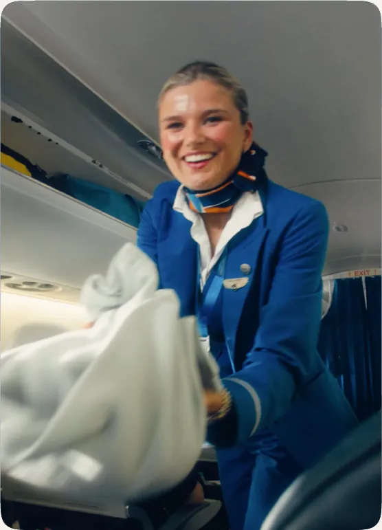
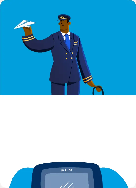
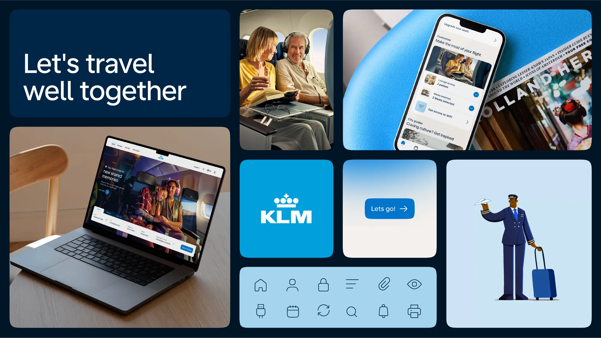
KLM cabin crew photographyKLM typography tile listing destinationsKLM pilot illustrationKLM shape language

Design ingredients

A Digital Experience Design Language (DXDL) is a framework that guides the design and development of branded digital products and services. Built on brand principles, it is the foundation for guidelines and components — so that every single element breathes KLM, consistently.

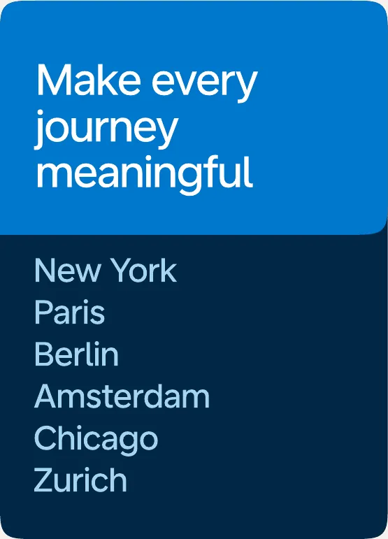
KLM headline tile: Make every journey meaningfulFamily travelling in the KLM cabinKLM icon tile
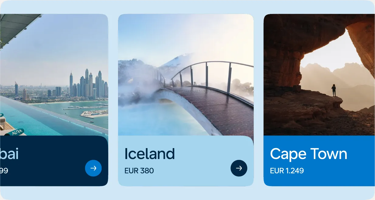
KLM destination cards

Typography

Typography is usually a big driver in building a strong digital design language, for two reasons.

The brand can be instantly recognised by its typography, and most of KLM's digital platforms and UI are text-heavy — a great opportunity to bring the brand look-and-feel into every screen.

Colour & balance

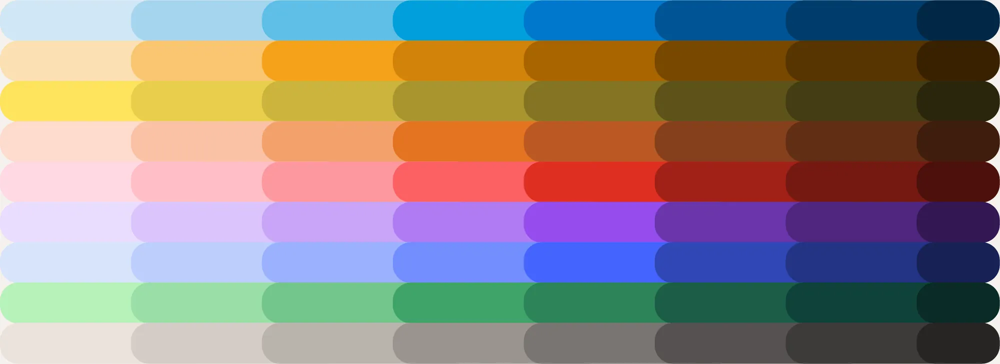
A digital-first colour system built for accessibility, with every tone on a scale from 50 to 900. KLM Blue lives at 400; tone 500 is optimised for interactive elements.

To meet both brand and accessibility needs, colour use is balanced across three levels of brand engagement:

Awareness — brand recognition in advertising, social media, aircraft and the airport.
Participation — the app, homepage, landing pages and marketing email, where the Sky Gradient adds recognition.
Functional — task-focused moments like booking, upgrades and service email.

KLM full colour palette
The three brand engagement levelsThe KLM Blue scale

Shape & iconography

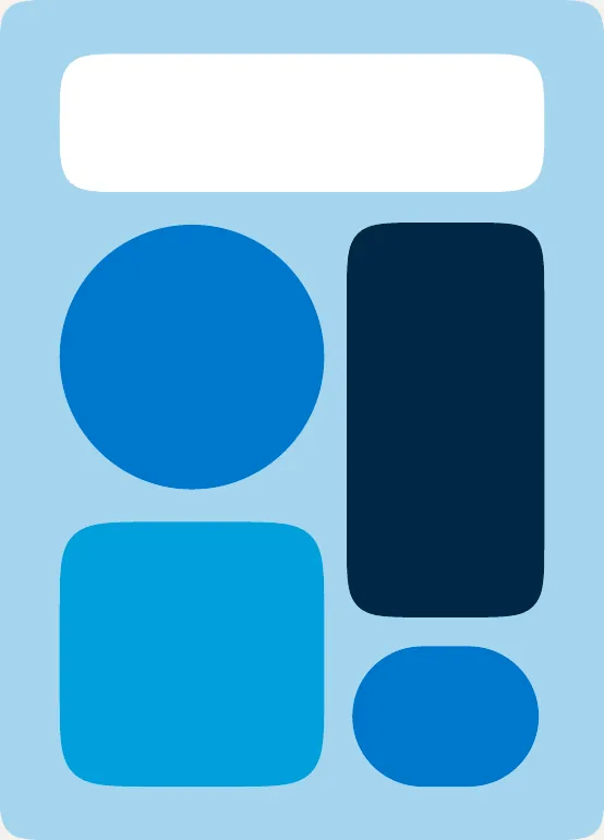
Shapes add warmth and personality without shouting. Smooth rounded corners feel softer and more human, while the journey stroke and dot offer a playful nod to travel.

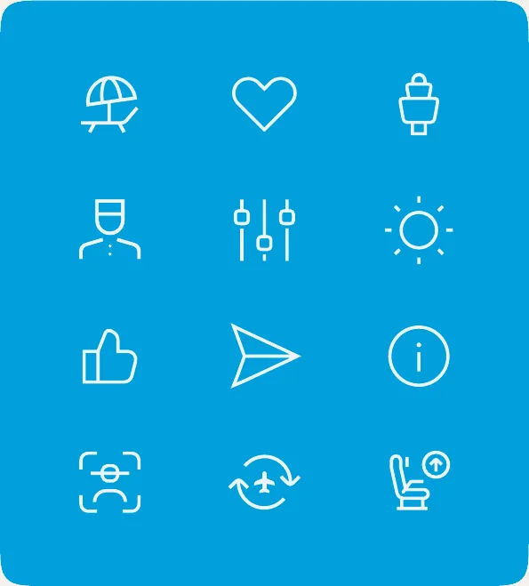
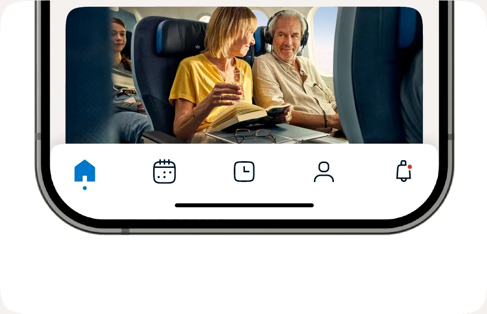
Icons carry the same shape language at small scale. Sharp stroke terminals match the Universal Sans typeface, and outlined and filled versions distinguish default from active states.

KLM logo on a rounded blue panelKLM curved journey shape
KLM app navigation icons

Across every touchpoint

A sky-inspired gradient centred on KLM Blue 400 opens and closes pages where accessibility limits the use of the primary blue, quietly reinforcing the brand. Single and multi-panel layouts keep KLM the obvious sender of every message — from the app to airport screens.

KLM app booking screensKLM digital billboard at the airport
KLM Travel Well campaign across touchpoints

To travel, means to Travel Well.

British Airways

Inspiring the journey before it begins

Discover on ba.com

Client
British Airways
Scope
Discover concepts for ba.com, across mobile and desktop
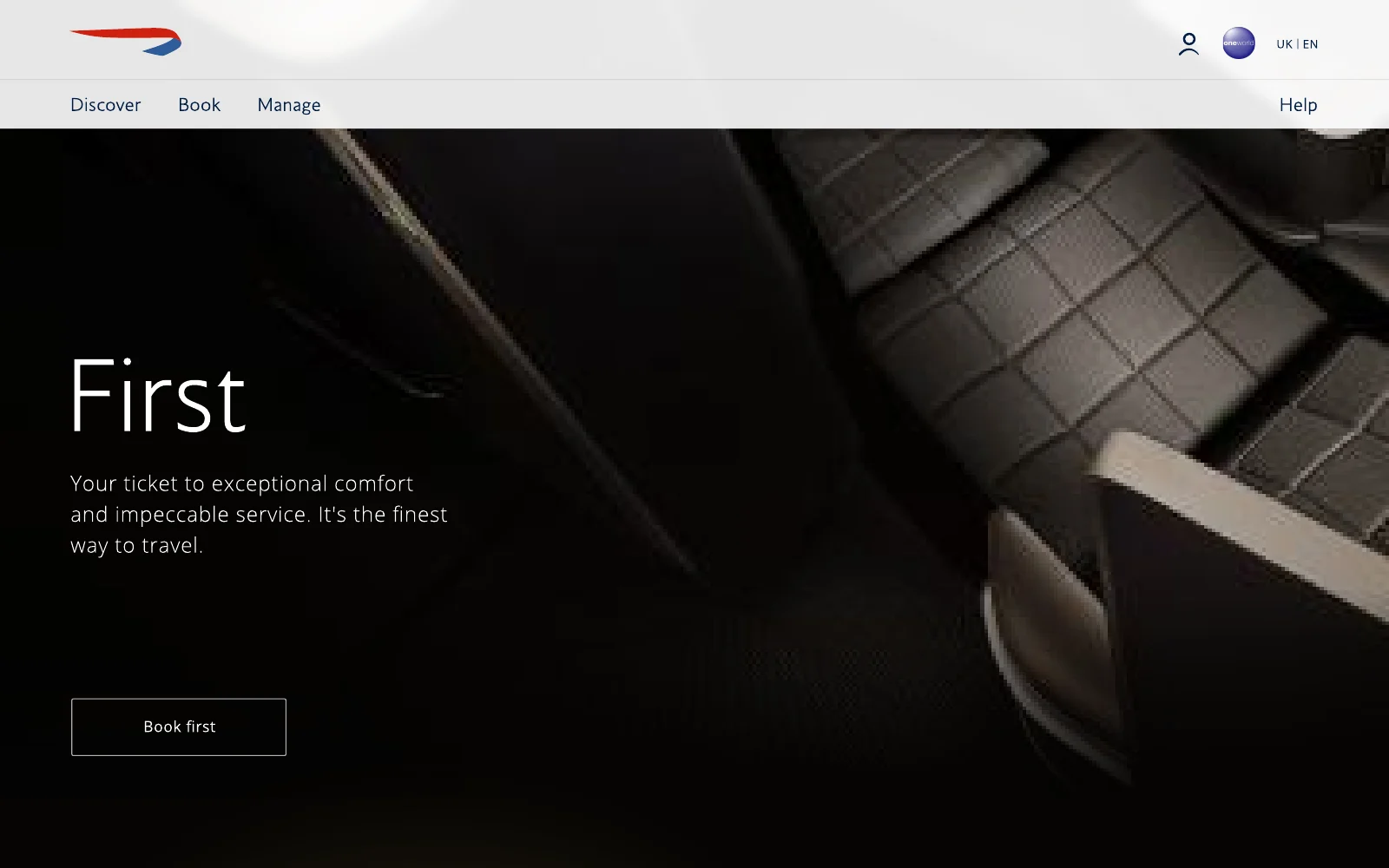
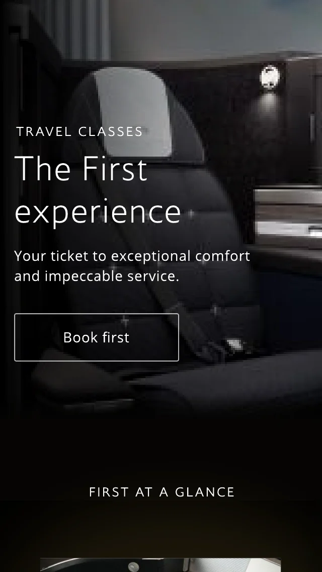
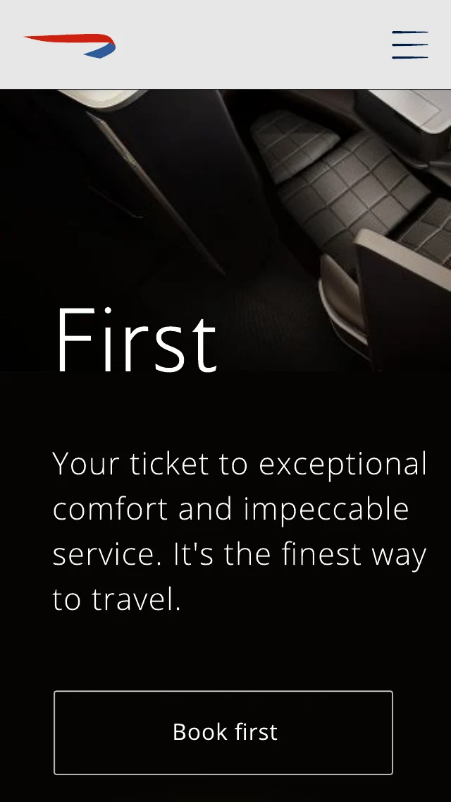
The First page on ba.com: Your ticket to exceptional comfort and impeccable service

Before anyone books, they dream. Discover gives ba.com a place to inspire, bringing the cabin, the lounges and the destinations to life long before the airport.

The approach

A family of concepts for the inspirational side of ba.com: immersive travel class pages, an experience hub, editorial stories and destination pages that lead naturally into booking. Even the practical pages, like hand baggage, were designed with the same care, so useful information feels part of the brand rather than an afterthought.

Immersive travel classes

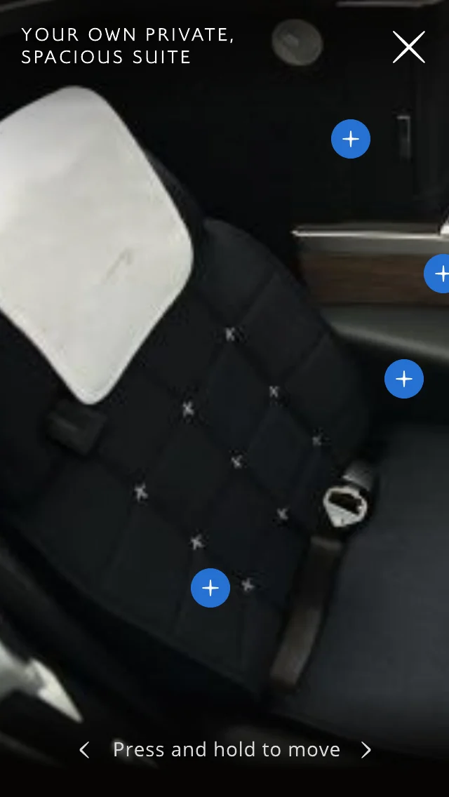
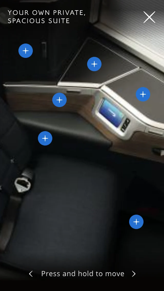
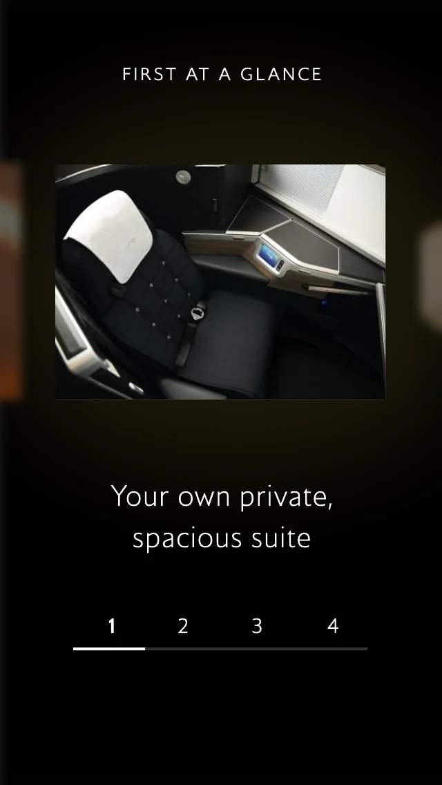
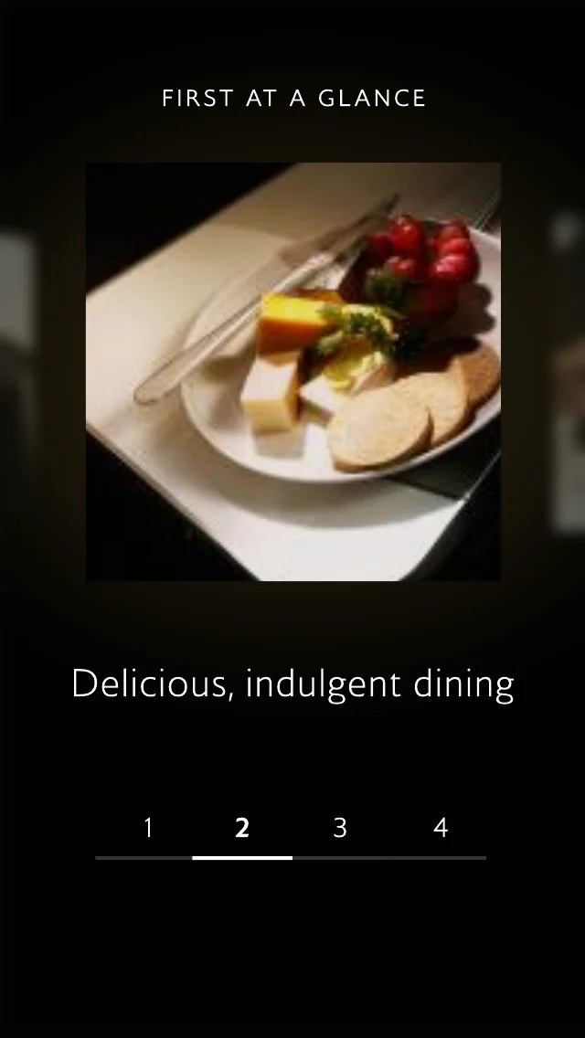
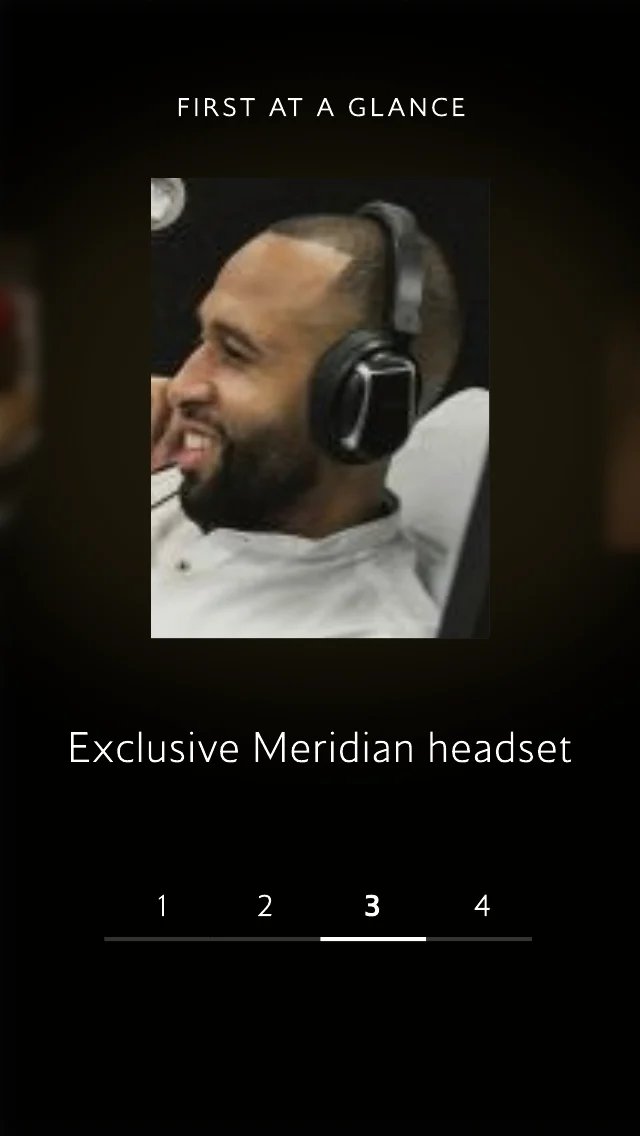
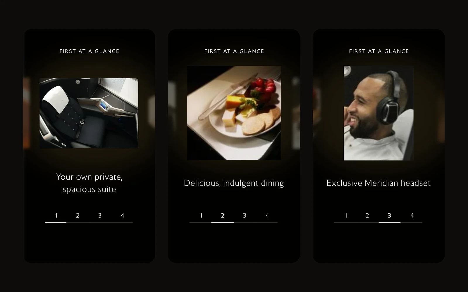
The First experience invites people to step inside the suite. Tap the hotspots to explore the seat, the materials and the details, or swipe through First at a glance: the dining, the Meridian headset, the Elemis amenities. Rich photography leads, with copy kept short and confident.

Exploring the First suite through hotspots on mobileHotspots on the seat controls and screenFirst at a glance: your own private, spacious suiteFirst at a glance: delicious, indulgent dining

One hub for the experience

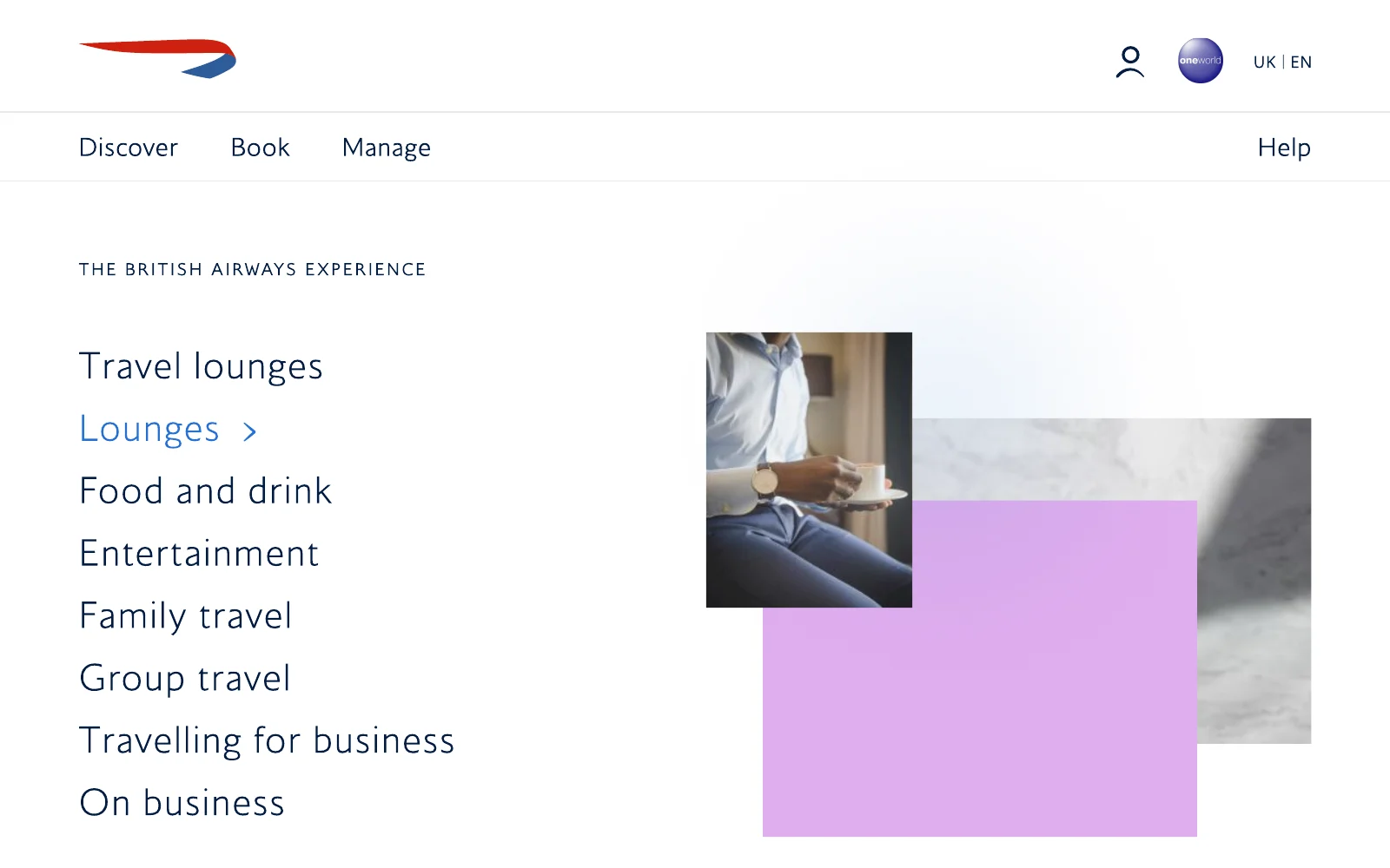
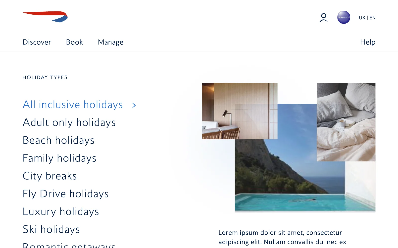
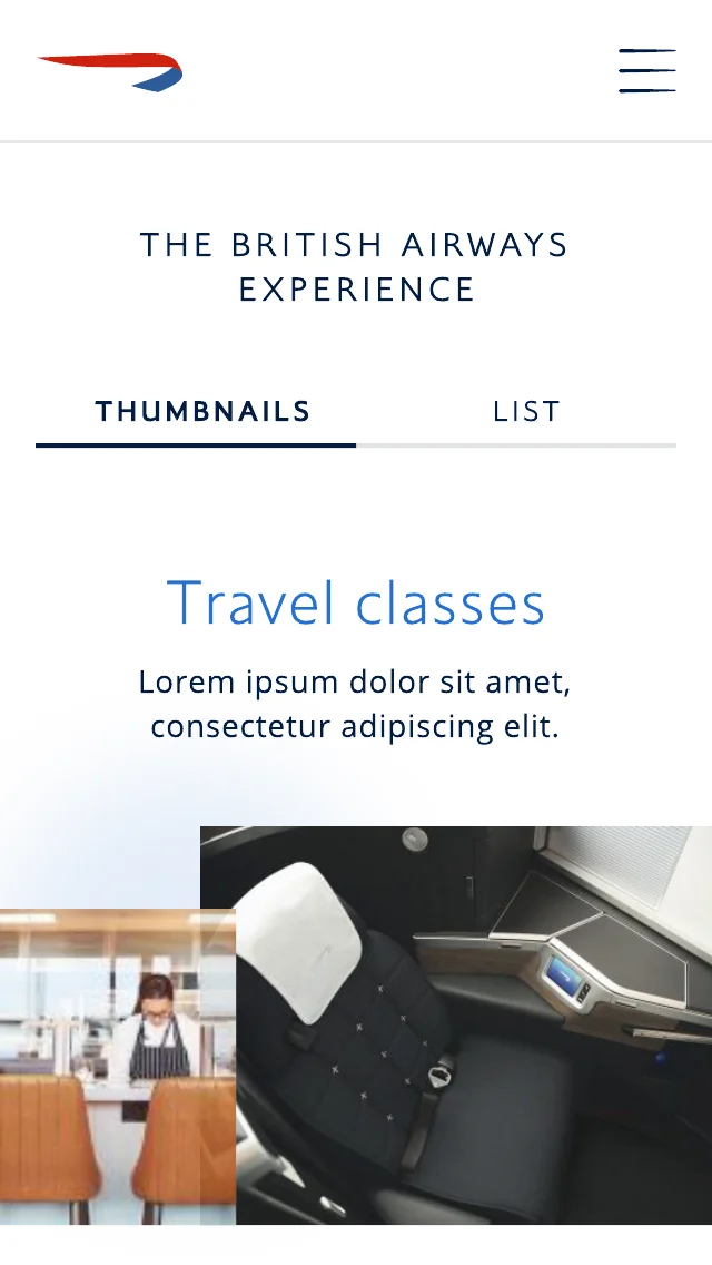
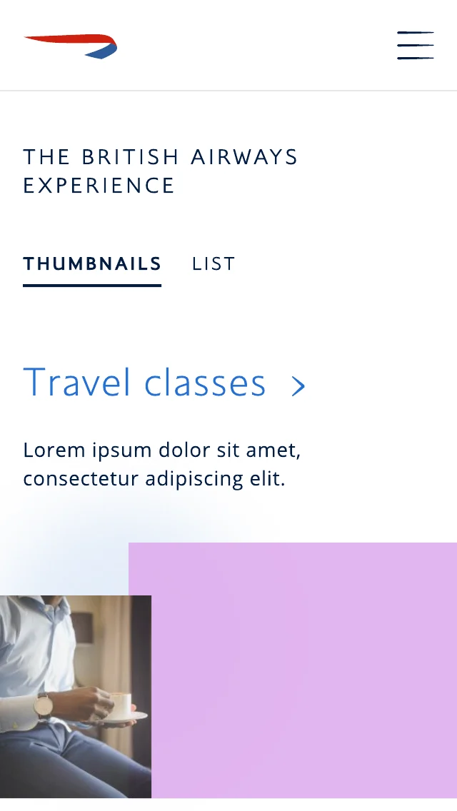
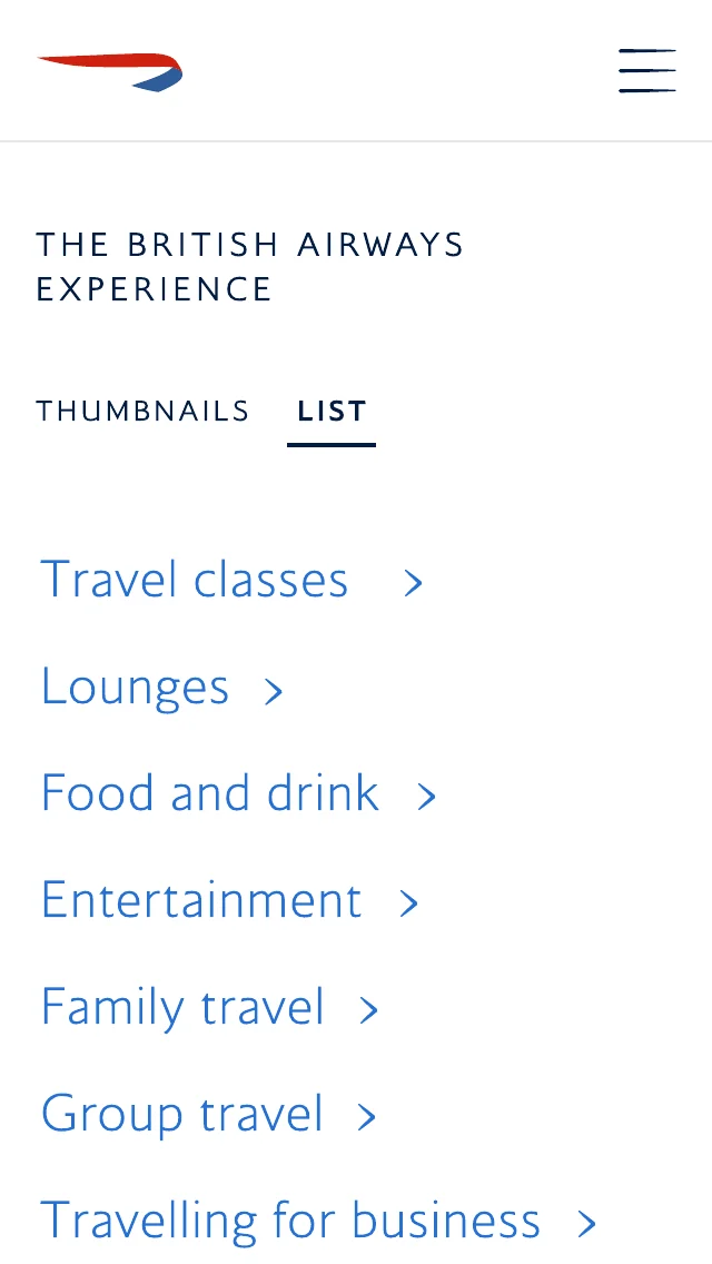
The British Airways experience brings travel classes, lounges, food and drink, entertainment and holidays into one place, browsable as large thumbnails or a quick list. On desktop, an image collage previews each topic as you move through the menu.

Experience menu on desktop with an image collage for loungesHoliday types menu on desktop with an image collage
The experience hub on mobile in thumbnail viewTravel classes in thumbnail viewThe experience hub in list viewThe First experience landing page on mobile

Stories that sell the brand

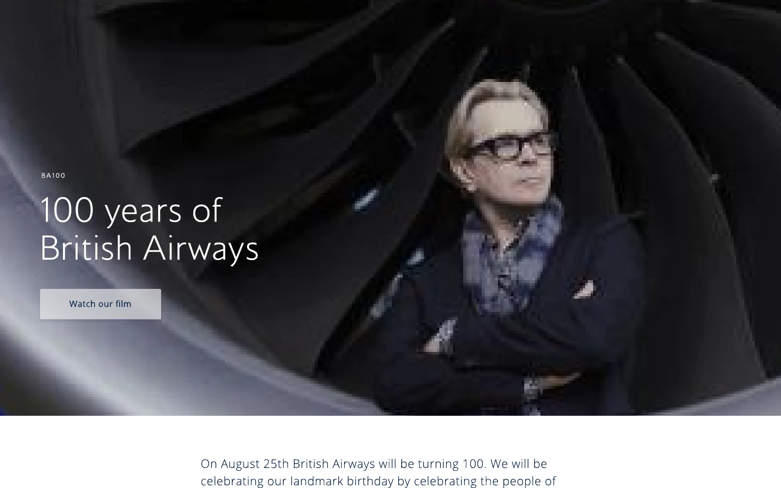
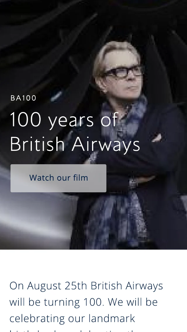
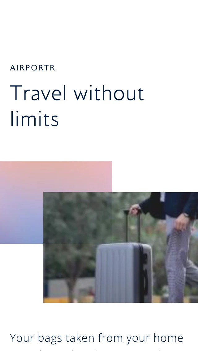
Editorial pages give British Airways a voice: BA100, celebrating the centenary and the people who made it, and partner stories like AirPortr’s door-to-door baggage service. Film, long-form storytelling and quiet calls to action sit side by side.

BA100: 100 years of British Airways, with a Watch our film button
BA100 story on mobileAirPortr: Travel without limitsFirst on mobile: your ticket to exceptional comfortFirst at a glance: the exclusive Meridian headset

From dreaming to booking

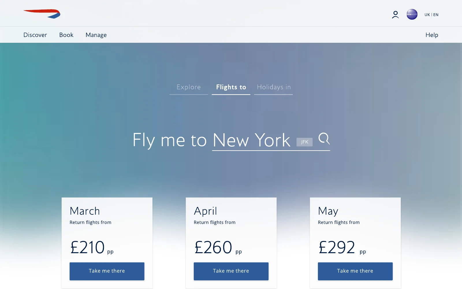
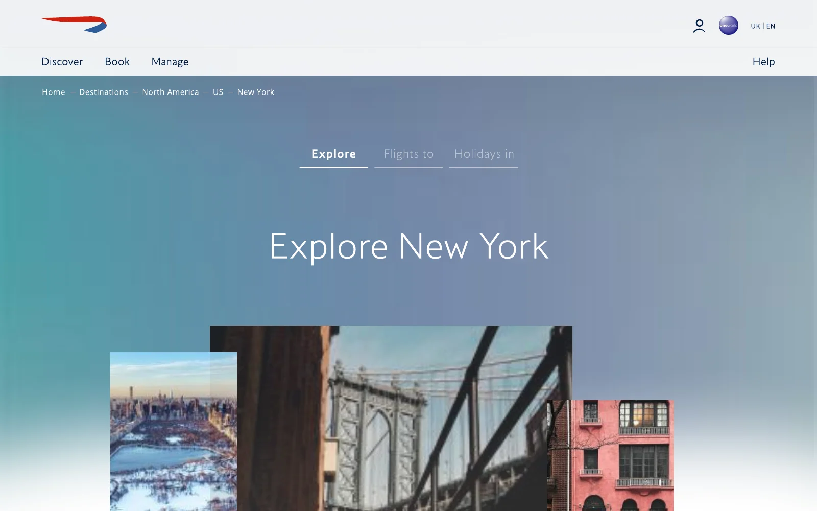
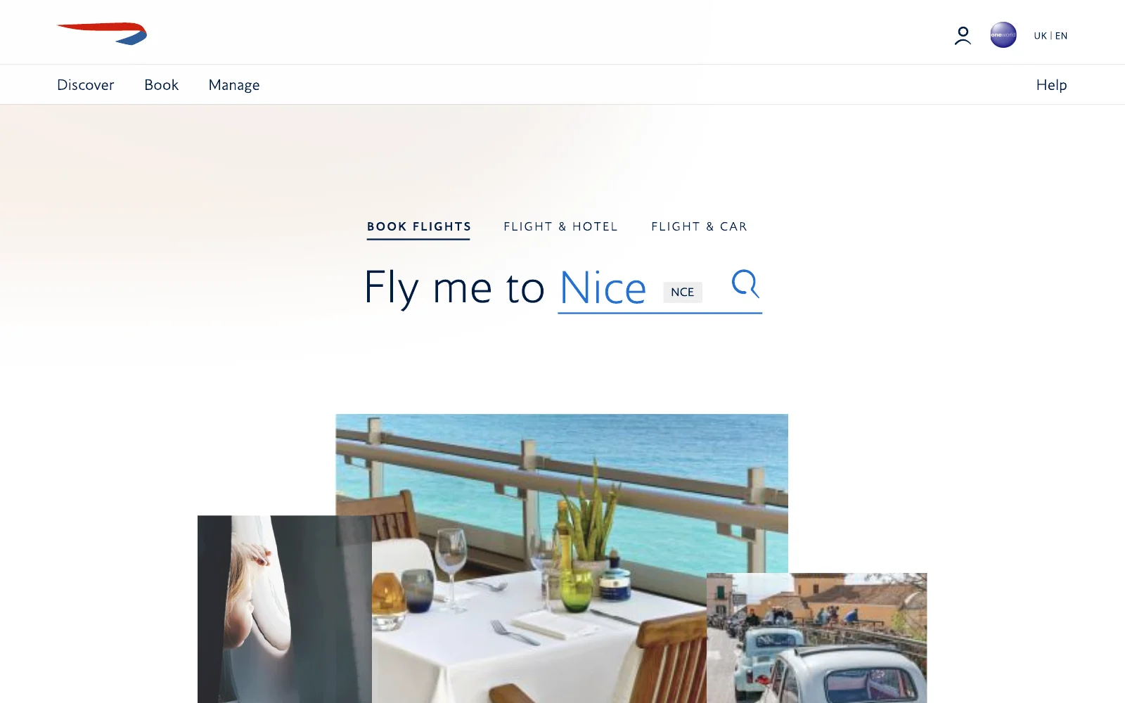
Destination pages turn inspiration into action. Fly me to New York puts the destination in the search itself, with the best fares by month, recommended hotels and holidays below, and Explore pages that capture the feel of a city before you search for flights.

Fly me to New York, with return fares from March to May
Explore New York destination pageFly me to Nice, with a collage of the Riviera

Useful, made beautiful

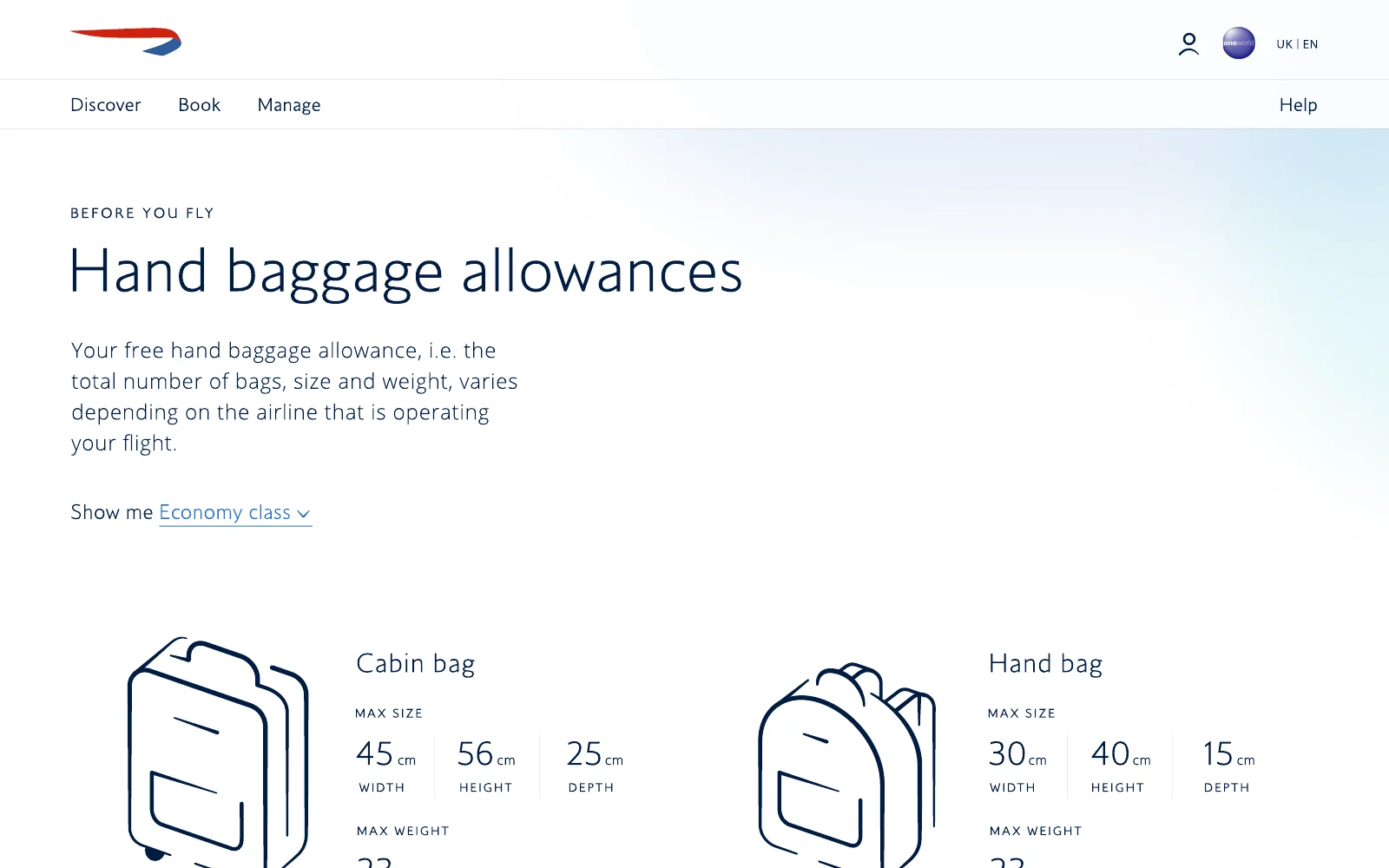
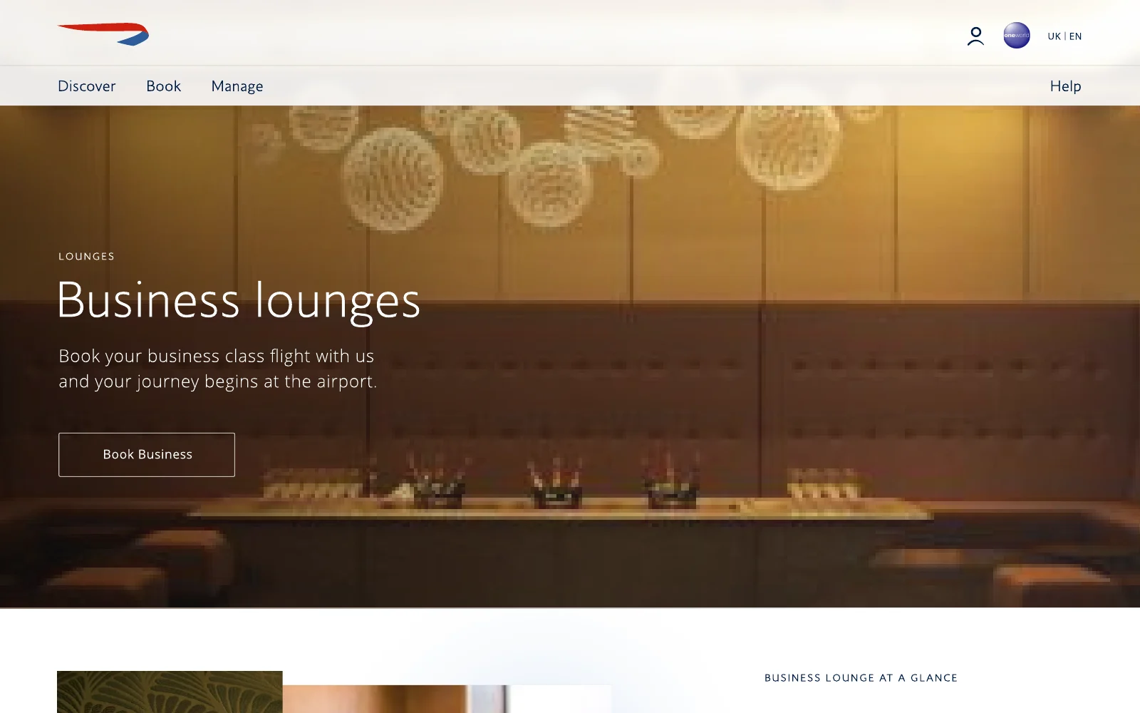
The same design language carries through to the practical moments. Hand baggage allowances become clear and visual, with dimensions you can take in at a glance, and lounge pages set the tone for the journey ahead.

Hand baggage allowances with clear dimensions for cabin bag and hand bagBusiness lounges page

Inspiration first, then the booking.

British Airways

Reimagining Manage My Booking

Design direction for the post-booking experience

Client
British Airways
Scope
Design direction, UX, content structure

Helping customers get travel-ready — surfacing the right information and services, at the right time, in the right way.

The challenge

Rethink how British Airways approaches Manage My Booking as one holistic experience: itinerary, Advance Passenger Information, luggage, onboard meals, upgrades and more — creating design patterns that work across every Manage My Booking flow.

Booking itinerary

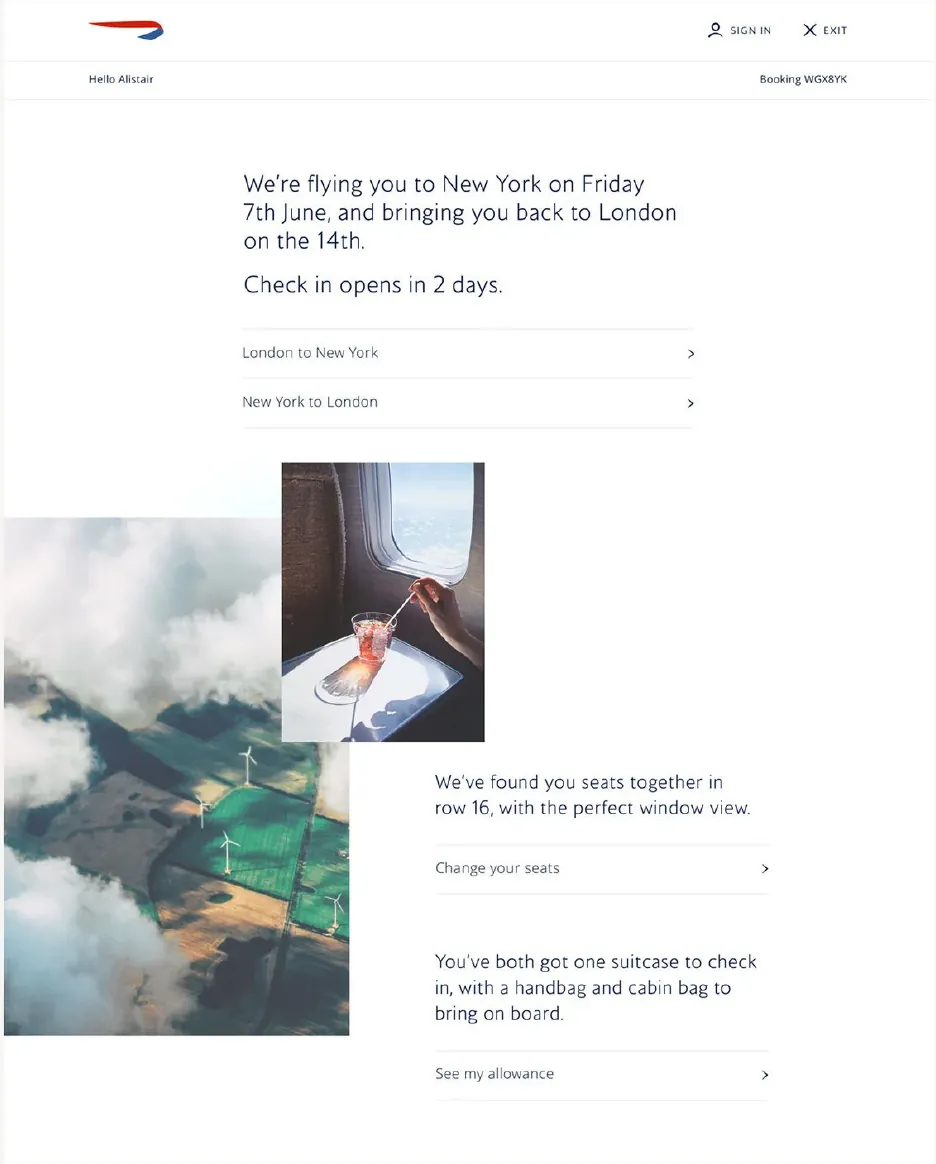
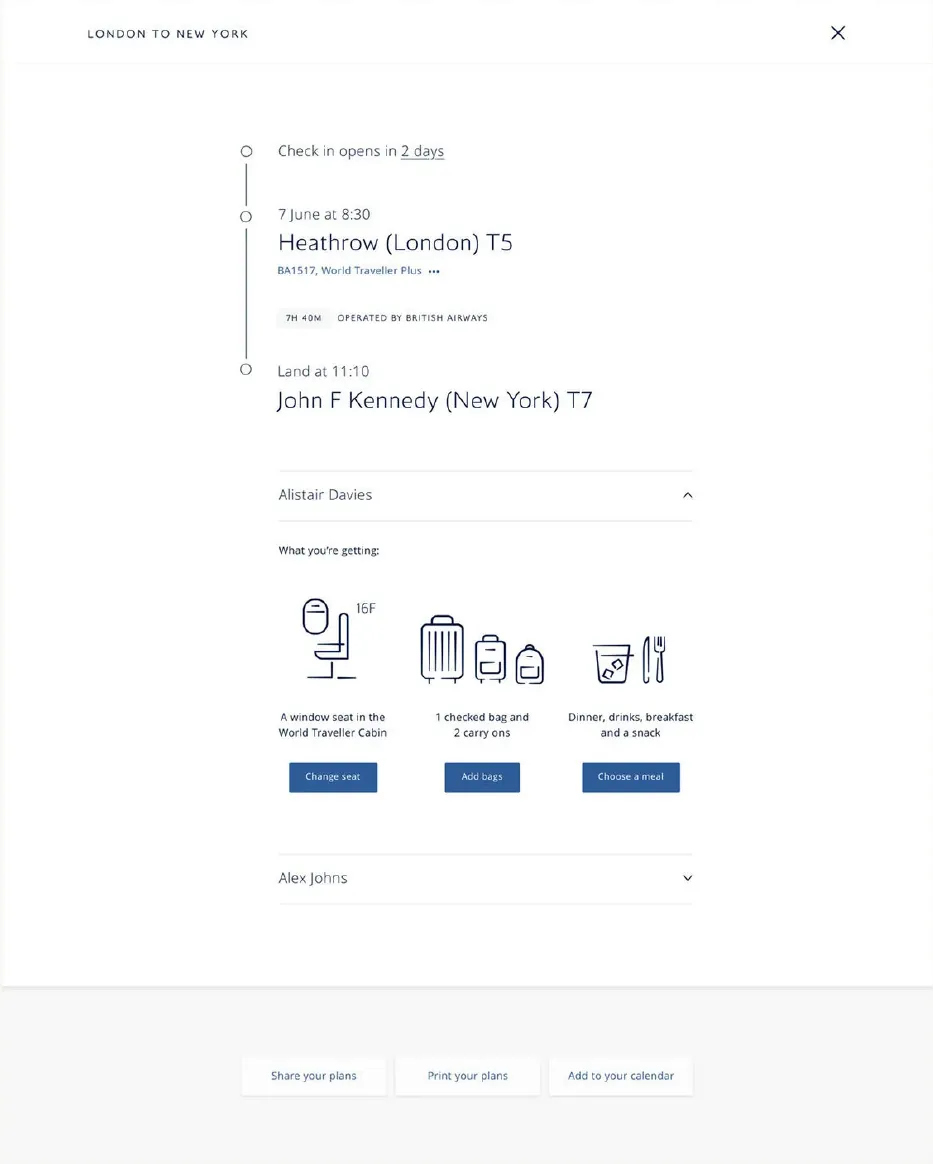
Built on the new British Airways design language, the experience uses a clear, conversational tone of voice — giving customers the information they need in a way that is clear, concise and quiet.

Conversational booking itineraryFlight detail and travel services

Content structure

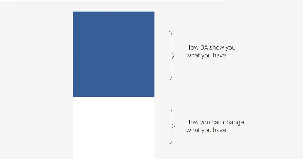
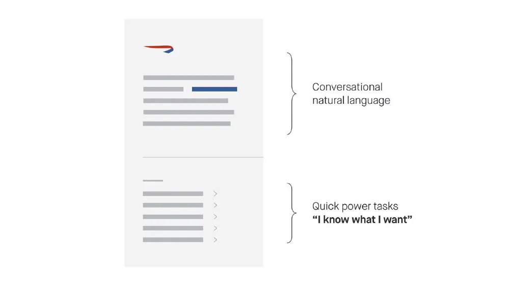
Putting control in the customer's hands, the experience plays back what they have, what they can change and how British Airways can help.

Content structure: what you have and what you can changeContent structure: conversational language and quick tasks

Refining the flow

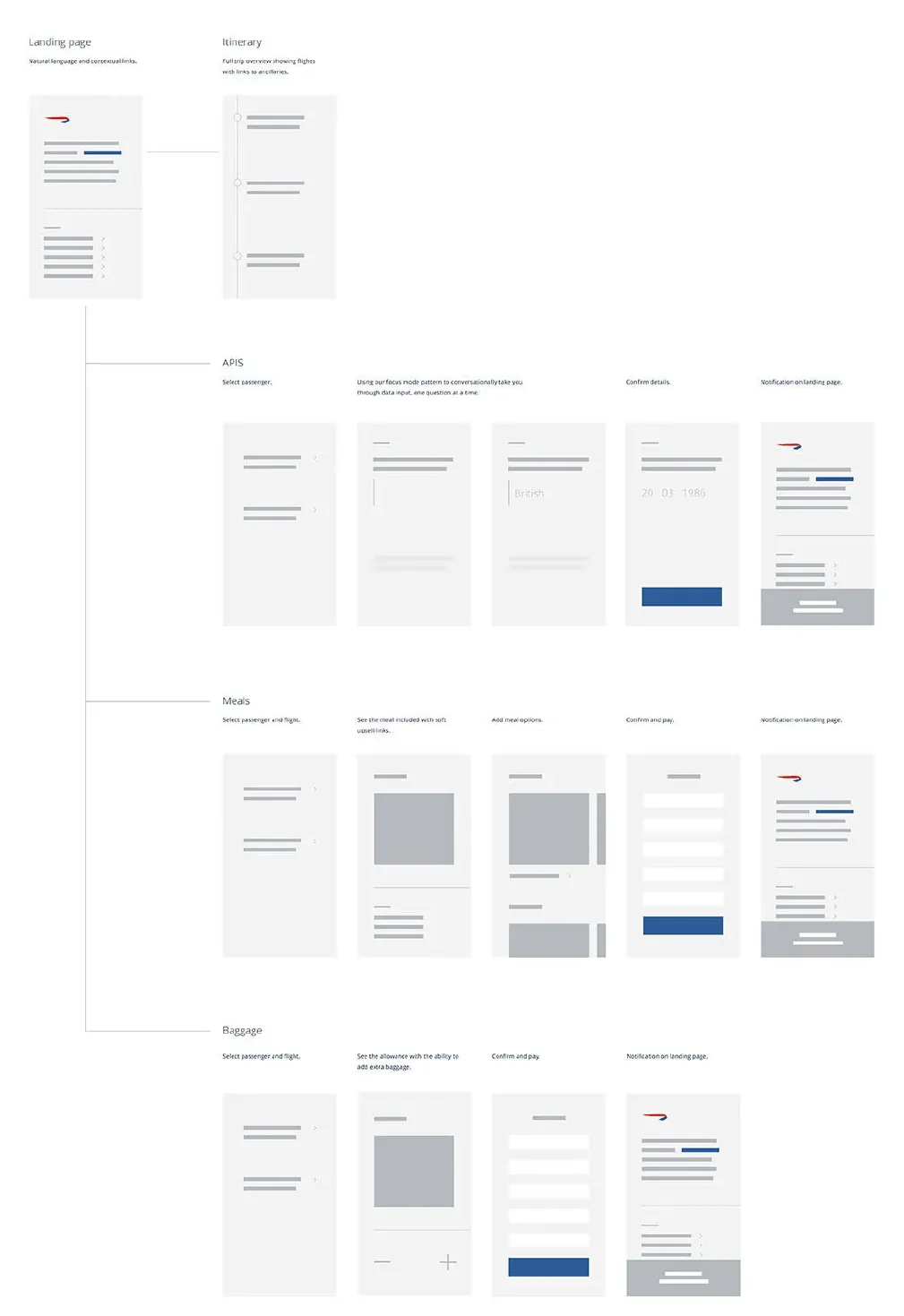
Reviewing everything in the previous Manage My Booking, stripping it back and developing a UX flow that lets both the customer and British Airways get the most from the experience.

Manage My Booking UX flow

adidas Group

Built for movement. Designed for impact.

Content & brand design direction

Client
adidas Group
Scope
Landing experience direction, brand storytelling, commerce
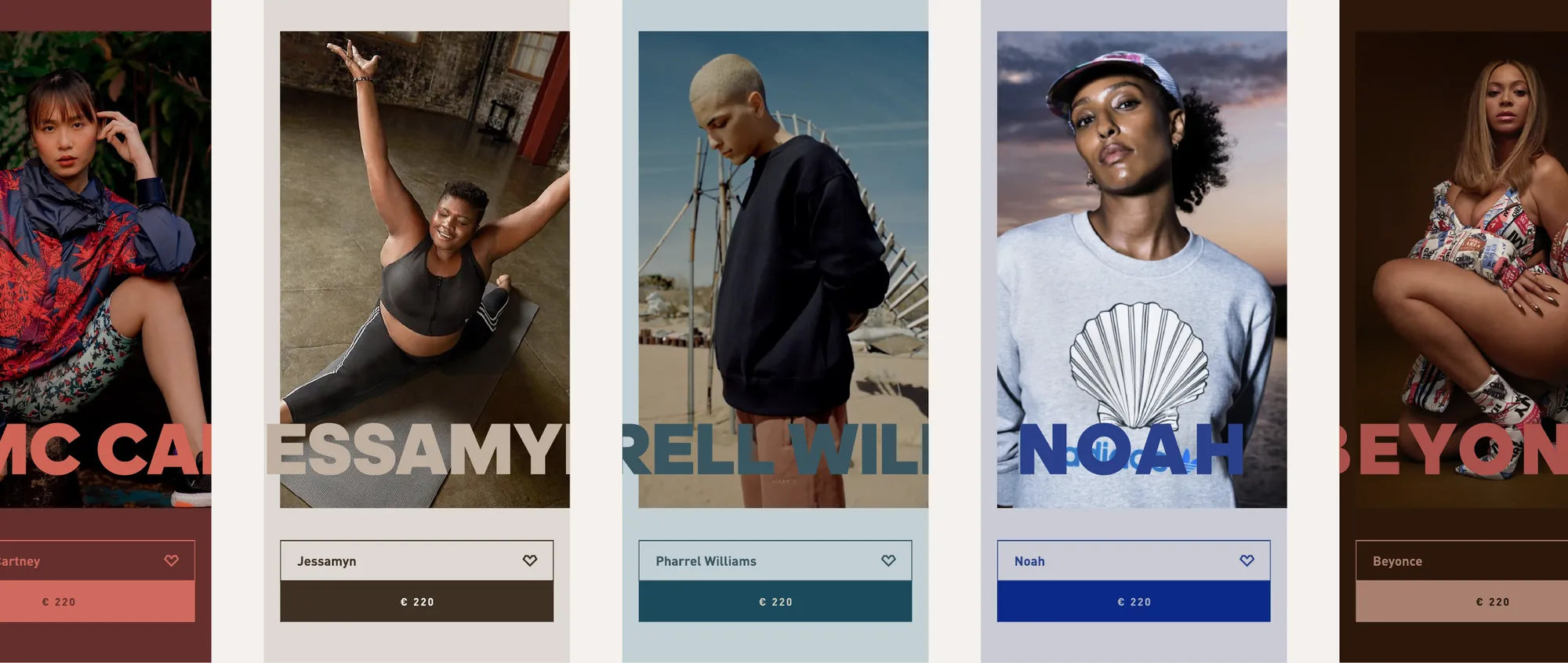
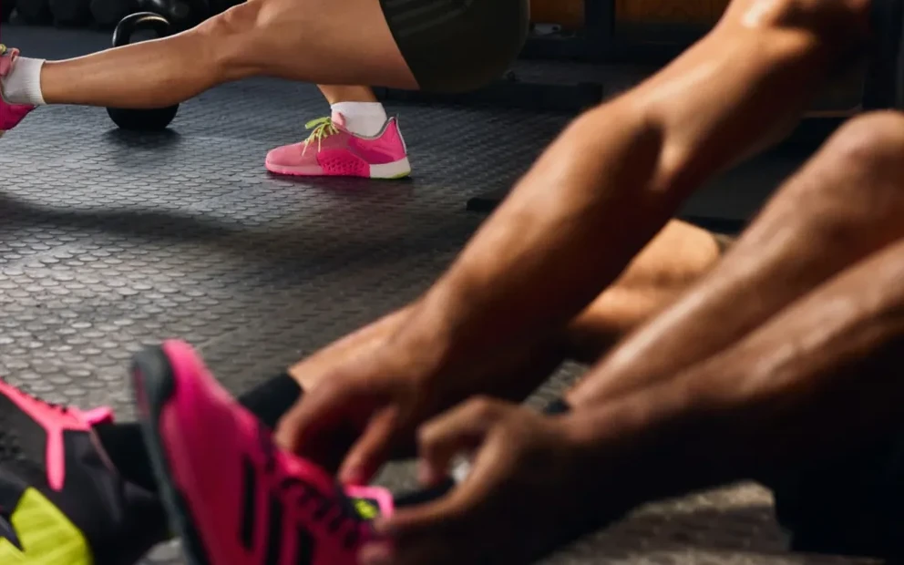
adidas athlete and product cards

Reimagining the adidas landing experience as a high-impact entry point for brand and commerce.

The objective & opportunity

The landing page is both a storytelling platform and a commercial gateway — but growing campaign demands, product drops and diverse audience entry points had made its hierarchy and flow complex. The goal: a dynamic, scalable framework that translates adidas' performance heritage and cultural relevance into a landing moment that feels immediate and immersive, while guiding people seamlessly to product.

Experience vision

A digital stage — immersive in feel, strategic in structure. Typography, motion and spatial composition create tension and release, echoing the physicality of sport.

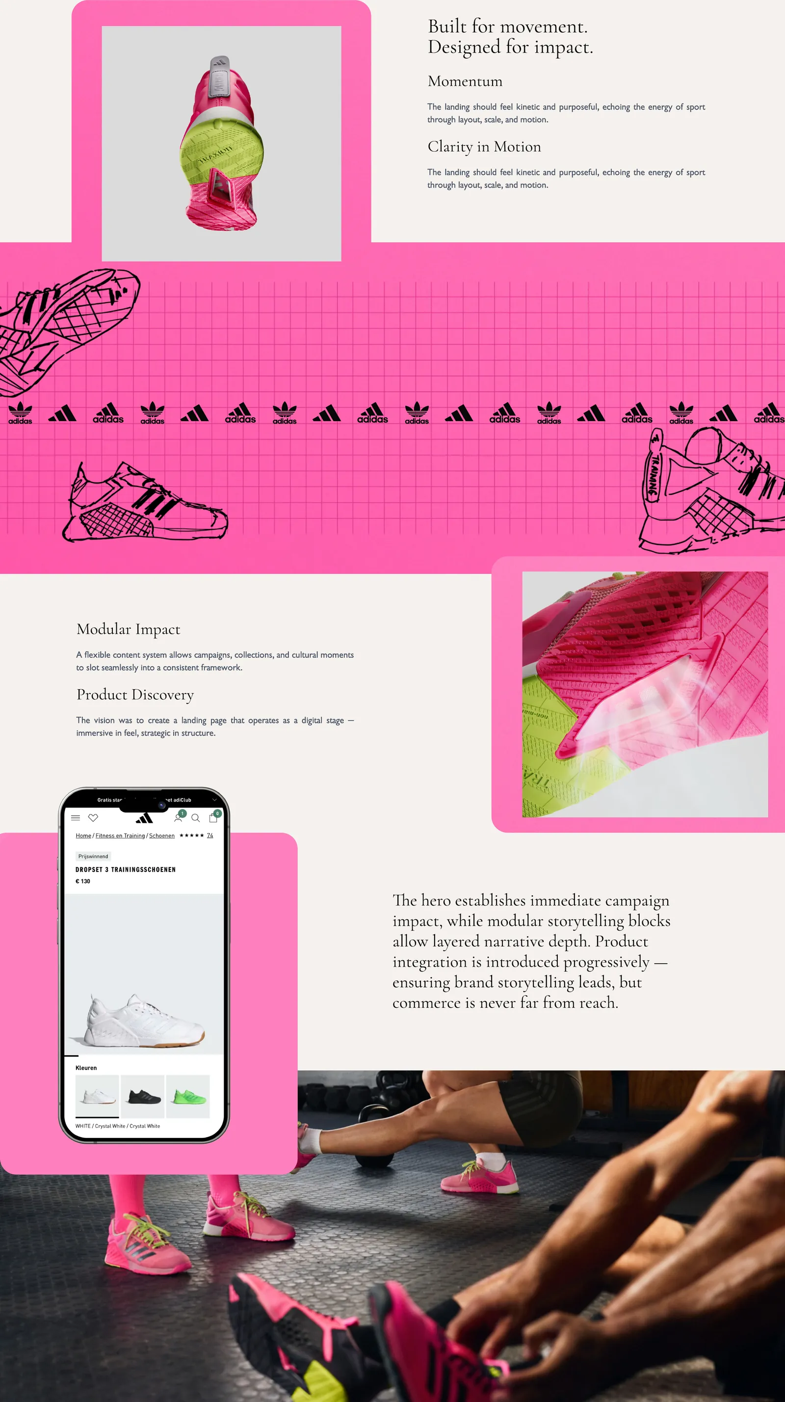
Momentum

Kinetic and purposeful, echoing the energy of sport through layout, scale and motion.

Modular impact

A flexible content system lets campaigns, collections and cultural moments slot seamlessly into one consistent framework.

Product discovery

The hero lands campaign impact; modular storytelling adds depth; product is introduced progressively — brand leads, commerce is never far away.

adidas landing experience direction: product, pattern, mobile and campaign imagery

Let's talk about the work.